


Information architecture • Interaction design
Vardal Turnforening
Reducing coordination through structure
A prototype connecting training schedules, participant information and session updates for a gymnastics club.
Project
Academic client project
Timeline
8 weeks • Autumn 2023
Client
Vardal Turnforening
Team
4 designers
My role
Research lead, information architecture, wireframes and prototype
Status
Concept & prototype
The challenge
Vardal’s information and communication were spread across its website, Spond, Facebook, text messages and email. Parents needed a clearer overview of activities, while trainers needed participant numbers and assistant coach availability to plan sessions.
The response
We developed a concept that brought activities, session details and communication into a shared experience. The focus was on helping users move from an overview to the information and actions relevant to a particular session.
My contribution
Working with another interaction designer and two graphic designers, I led the research work within our team, synthesised insights through affinity mapping, defined the information architecture, and designed wireframes and the interactive prototype.
Research
Small changes created more coordination work
We combined our parent interview with interviews shared by other student groups, covering parents, trainers and board members. Affinity mapping highlighted recurring needs: a clearer overview and relevant information in one place.
Parent interview
Shared interview data
Affinity mapping
Personas
Scenarios
Coordination depended on remembering information across channels.
Bring relevant planning details together in the session view.
Changes to activities created additional follow-up work.
Connect session information with a direct route to editing it.
Users needed an overview before detailed information.
Start with the calendar and reveal session details when needed.
The parent perspective
Parents also described difficulty distinguishing between their children’s activities and finding relevant updates. This reinforced the need for clear organisation, and informed proposals for profile switching and notification preferences.
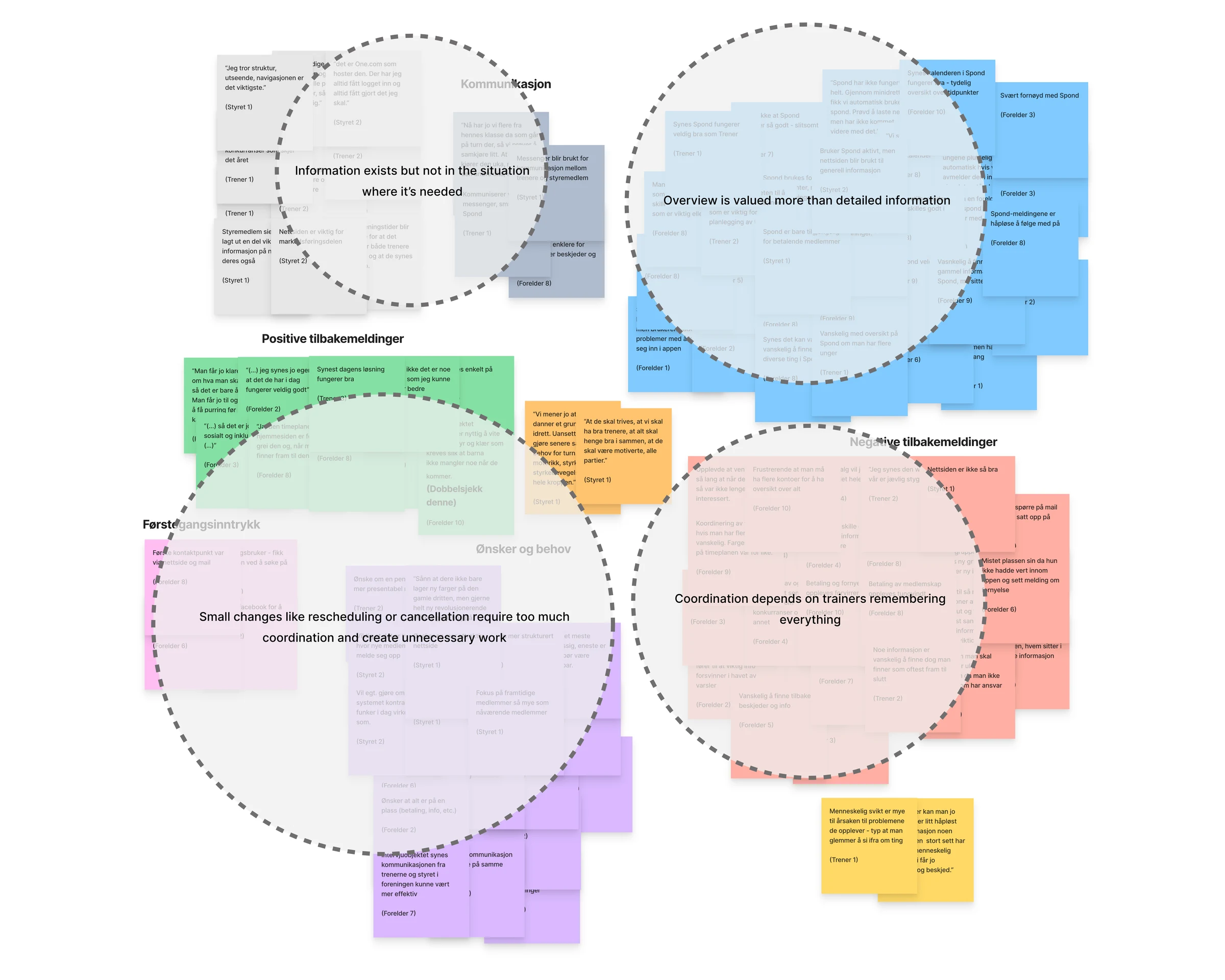
The affinity map. Notes are clustered by theme (in Norwegian), with the four insights we drew from them circled.

Structure
Define the structure before designing the screens
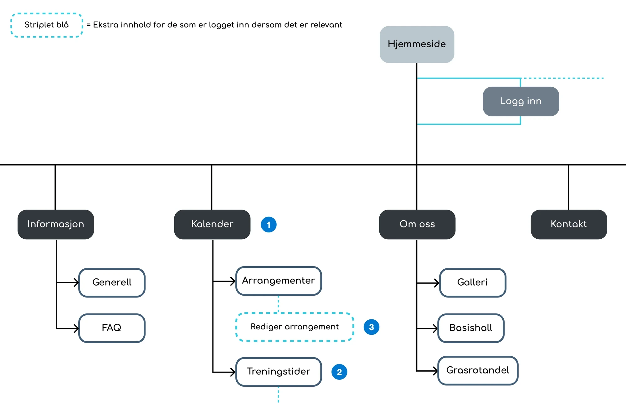
We used a top-down approach to connect public information with logged-in functions. The calendar gave trainers a route from an activity overview to session details and editing.
1
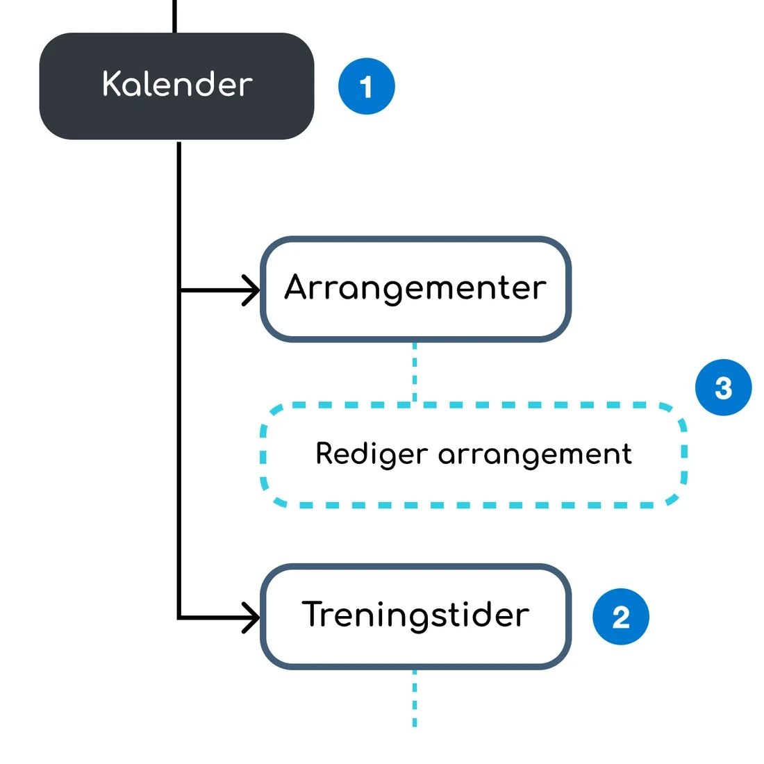
The calendar (Kalender) is the entry point to activities.
2
Events (Arrangementer) and training times (Treningstider) stay separate branches.
3
Editing, such as Rediger arrangement, is added for logged-in users where relevant.
Focused view of the original sitemap. Dotted blue outlines mark additional content for logged-in users where relevant. Original artefact in Norwegian; numbered markers added.
Work out the path from overview to action
Using personas and scenarios, we combined individual sketches into shared wireframes. These explored how trainers move from the calendar to session information and editing.
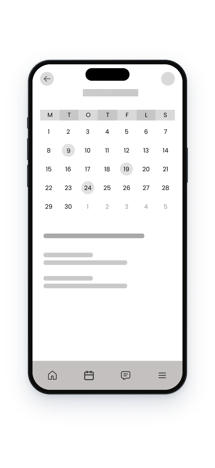
Calendar overview
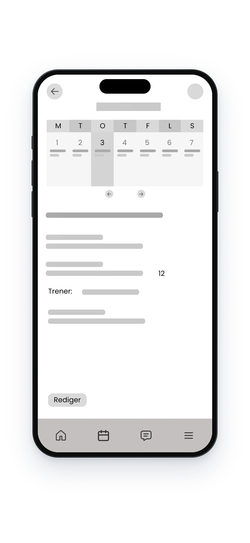
Session details
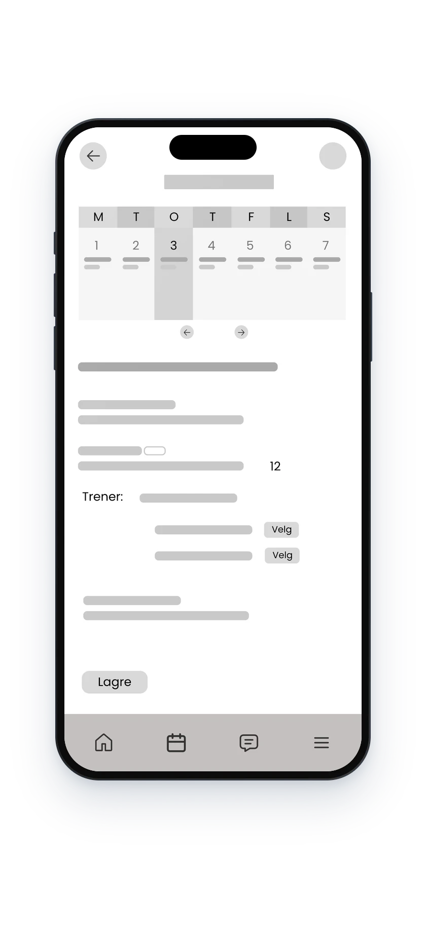
Editing and trainer selection
Early wireframes explored the path from a calendar overview to session details and editing.
Prototype
Plan a session from one connected flow
Scenario
Sølvi is preparing the next training session. She needs to check how many participants are attending, arrange assistant coach support and update the session information.
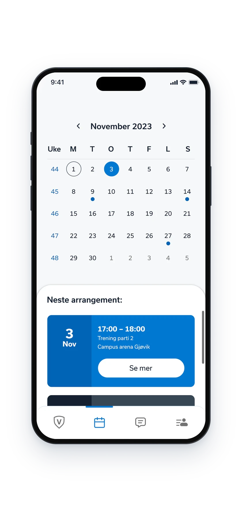
1
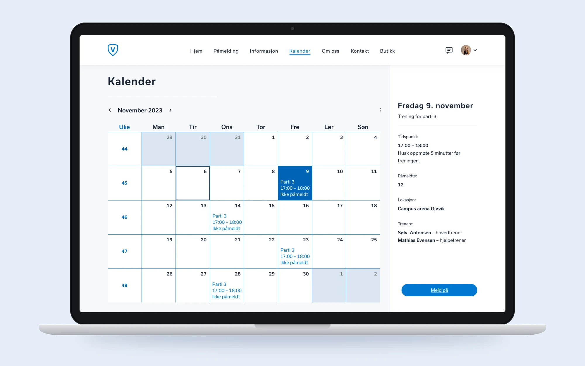
Find the session
The calendar connects upcoming activities with the session Sølvi needs to plan.
From the calendar to a specific training session.
2
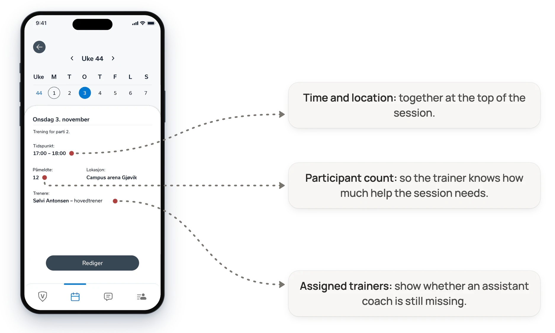
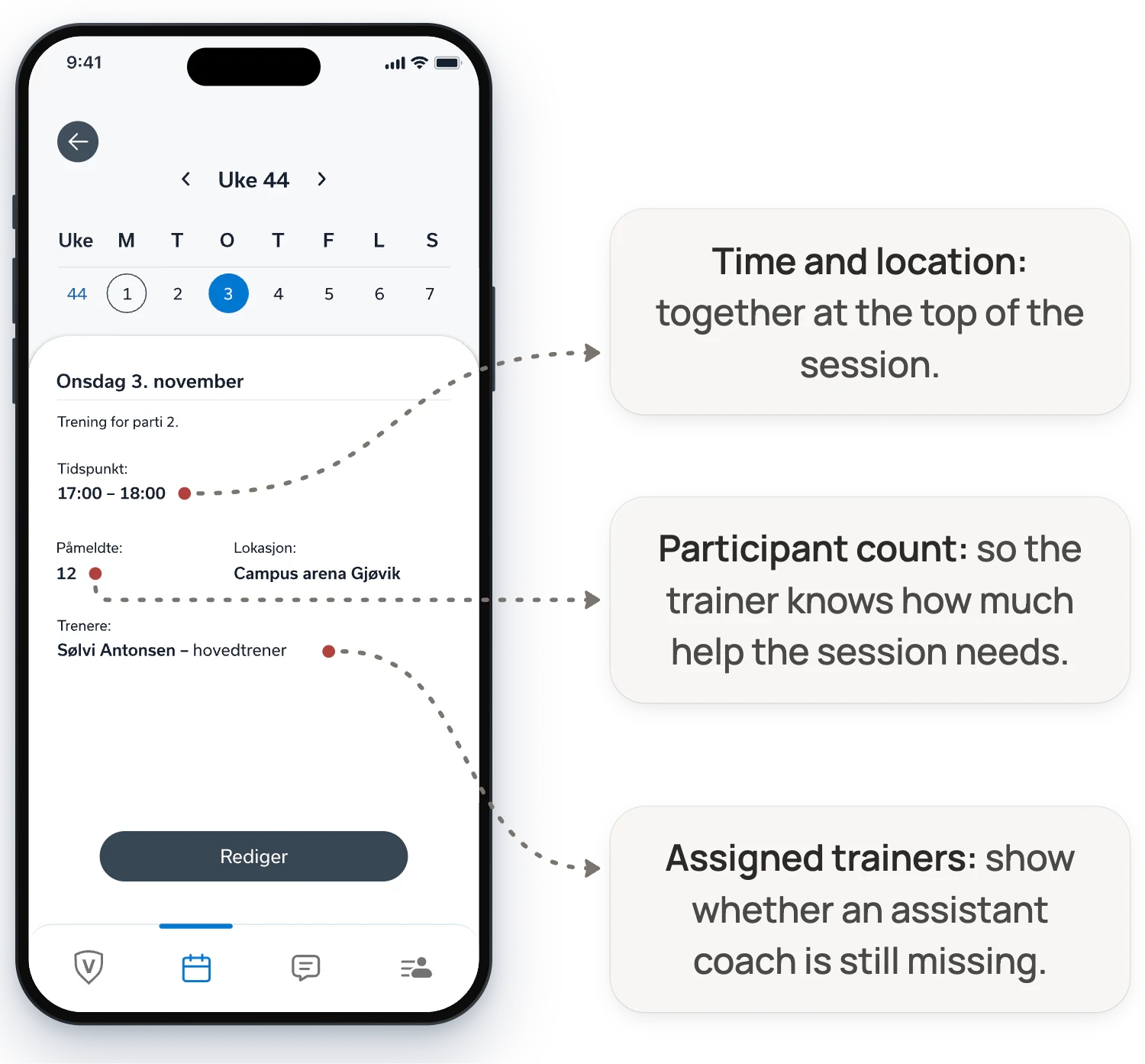
Check the planning details
Time, location, participant count and assigned trainers appear together in the session view.
3
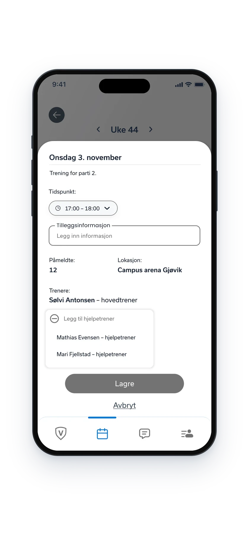
Update and save
Sølvi can edit session details and manage assistant coach assignments before saving.
Editing remains connected to the session being planned.
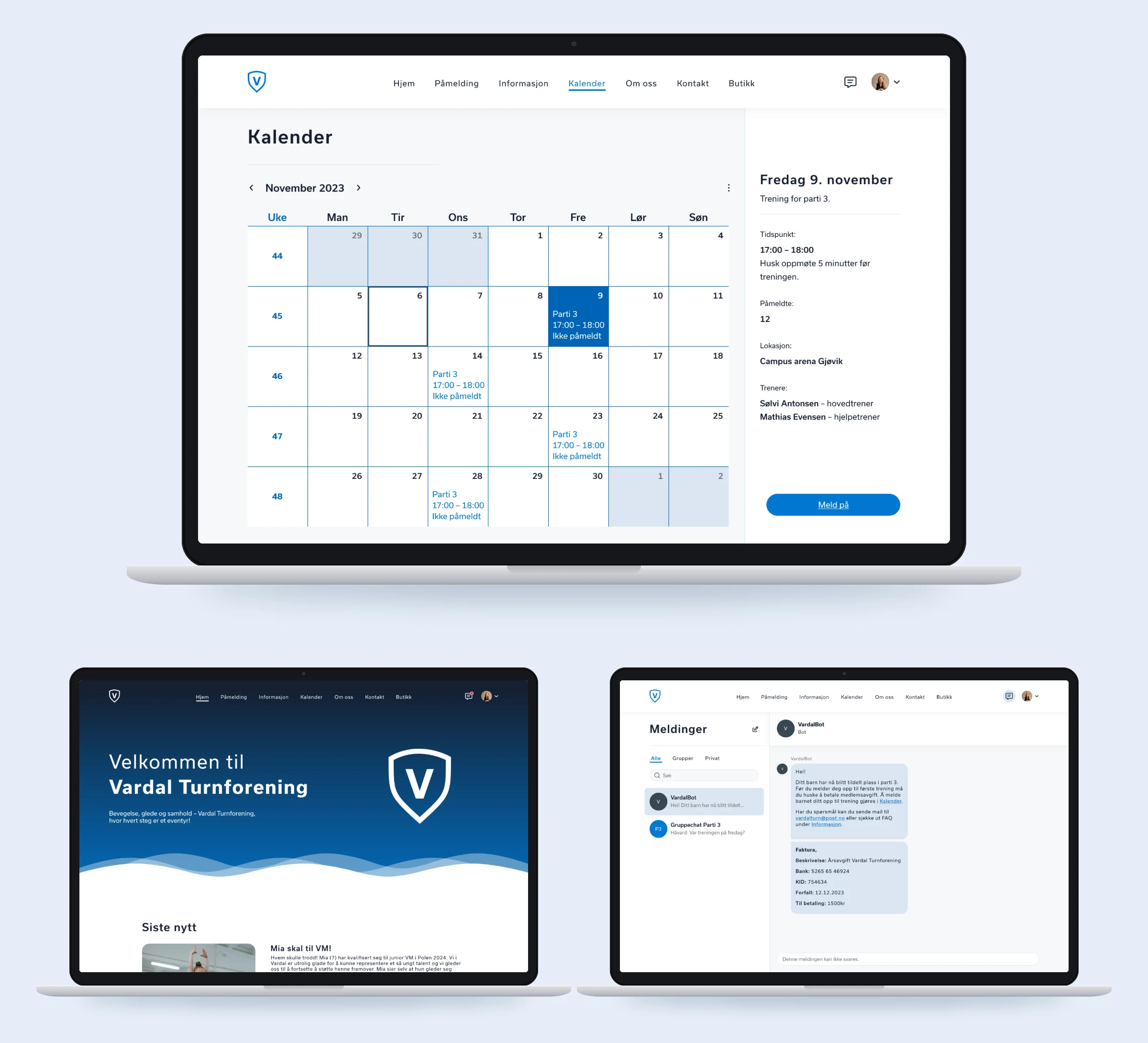
The prototype connects the overview, planning information and editing steps within a single experience.
Accessibility considerations
Bringing session details and editing into one connected flow aimed to reduce how much information trainers needed to remember across channels. Further accessibility work would check that session changes and save status are clear, that schedules stay readable on small screens, and calendar navigation, form labels and feedback with keyboard and screen-reader users.
Reflection
A prototype for shared planning
We produced an information architecture and an interactive prototype that connected activity planning, session details and communication. The report records positive feedback from initial prototype testing, but further testing with Vardal’s own users was needed to assess how well it would support everyday coordination.
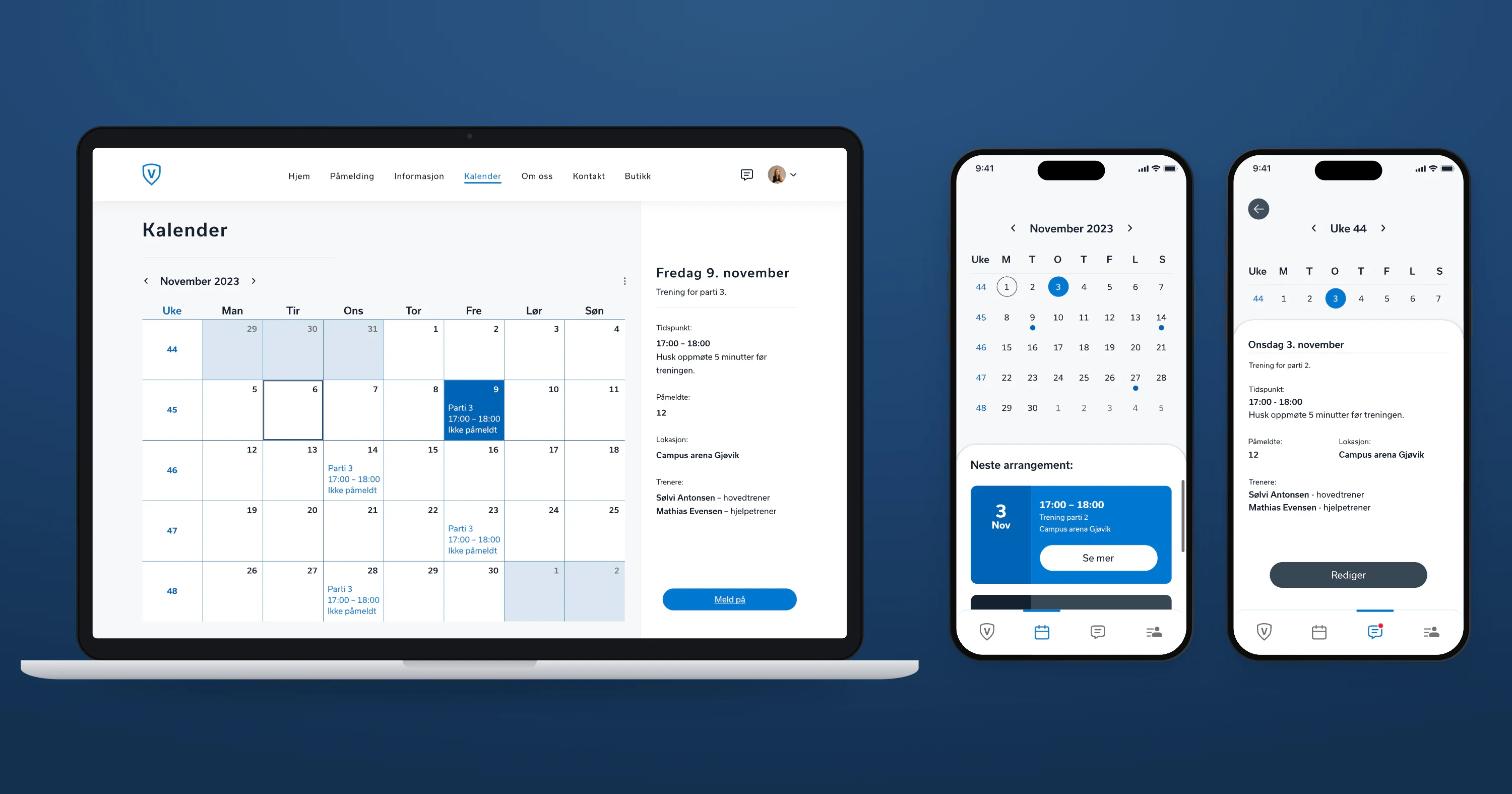

The high-fidelity prototype, from the calendar to a session with a helper trainer added.
What we delivered
Research synthesis translated into user needs and scenarios.
A sitemap connecting information and member functions.
Wireframes and a high-fidelity coordination prototype.
Structure shapes the work behind the interface
This project strengthened my understanding of how information architecture affects the effort required to complete everyday tasks. Working on the hierarchy first helped us connect each screen to a user goal, rather than treating the interface as a collection of separate features.
If I continued the project, I would test realistic changes to a training session with trainers and parents, checking what they can complete independently and where they still need to contact someone for clarification. I would assess task completion, missed information and follow-up needs before drawing conclusions about reduced coordination effort.
Credits
Team: Asma Al-Sahli, Fredrik Forsberg, Jenny Ngo Luong and Mia Tomren • Supervisor: Eivind Johansen • NTNU IDG3009 Information Architecture, 3rd semester, autumn 2023
Read next

