

Norkart
Structuring onboarding for Tōitsu
During my internship at Norkart, I helped shape the “Getting started” pages for Tōitsu, the company’s design system. Working with another design intern, I organised onboarding content, designed page layouts and wrote guidelines for selected UI components.
Project
Internship at Norkart
Timeline
8-week internship • Autumn 2024
Team
2 design interns, with Norkart’s designers and developers
My role
Interaction design intern: design system onboarding, content structure and component guidance
Structured getting-started content around different work needs.
Designed onboarding layouts using the existing system.
Wrote guidance for using selected components consistently.
My contribution
Working with another design intern, I reviewed existing insights and helped interview developers, co-structured the onboarding content and page hierarchy, designed low- and high-fidelity interactive prototypes, and wrote selected component guidelines with responsive layouts for handoff.
Brief and contribution
Giving people a starting point
The brief
Tōitsu was being prepared for launch when we joined. Our task was to help colleagues understand how to get started: which resources were relevant, how to access their tools and where to find guidance for everyday work.
Scope
The design-system foundations were already being developed by Norkart’s team. We worked within that framework, focusing on the content and layout of the onboarding pages. I also wrote usage guidelines for selected components.
Content structure
Deciding what people needed to get started
We began with research. We looked at how other design systems handle getting started, conducted interviews, and built on insights Norkart had already gathered about the people using Tōitsu.
From there, we mapped everything that could belong in onboarding and grouped it into four content areas. Each area links the page structure to a practical task, such as finding implementation documentation or starting with the Figma library.
Design system benchmarking
Interviews
Existing Norkart insights
Content mapping
Four content areas
Setup and access
Getting into tools and the right team spaces
Documentation
Where implementation and design guidance lives
Tools
What each tool is for in daily work
Support
Where to ask when something is missing
Onboarding
Different starting points, a shared structure
The onboarding pages group resources around the work people do. Designers find guidance for the Figma library and design tools; developers find setup, technical documentation and implementation resources.

Designer onboarding: an overview of resources plus practical guidance for Tōitsu in Figma. Screens in Norwegian.
From finding the system to using it in Figma
The designer page opens with key resources, followed by tool guidance and setup steps. Topics such as auto layout, components, variants and themes sit in expandable sections, while the Figma getting-started steps stay visible.
1
Entry points to key resources open the page.
2
Numbered, always-visible steps for getting started in Figma.
3
Expandable sections for topics such as auto layout and variants.
Expandable sections keep the overview compact, so each label must say clearly what sits inside.
Connecting setup, documentation and tools
The developer page splits setup, documentation and tools into clear sections. It links to the monorepo and Material UI documentation, and explains where tools such as Azure DevOps, Git and Figma fit in the workflow.
1
Setup information comes first.
2
Monorepo and Material UI documentation in one section.
3
Each tool described and paired with its link.
This export shows the logged-out state, so setup content sits behind a sign-in notice.


Developer onboarding: the resources needed to start working in the existing technical environment. Screens in Norwegian.
A consistent way to navigate the information
On every page, section navigation gives an overview of the content. Tools and useful links have their own areas, and a support prompt shows where to ask for missing guidance.
Guidelines
Making usage guidance explicit
Alongside the onboarding pages, I wrote usage guidelines for selected UI components. That meant understanding the existing system and explaining how each element should be used: recommended practices and what to avoid.
It taught me to design for the decisions someone makes when using a component, not only the component itself.
A usage-guidance example from Tōitsu: recommended practices alongside situations to avoid. In Norwegian.
Outcome and reflection
Contributing to a system preparing for launch
Our onboarding ideas were taken forward as Tōitsu prepared for launch. My contribution included content structure, page layouts and selected component guidelines, developed in close collaboration with Norkart’s design team.

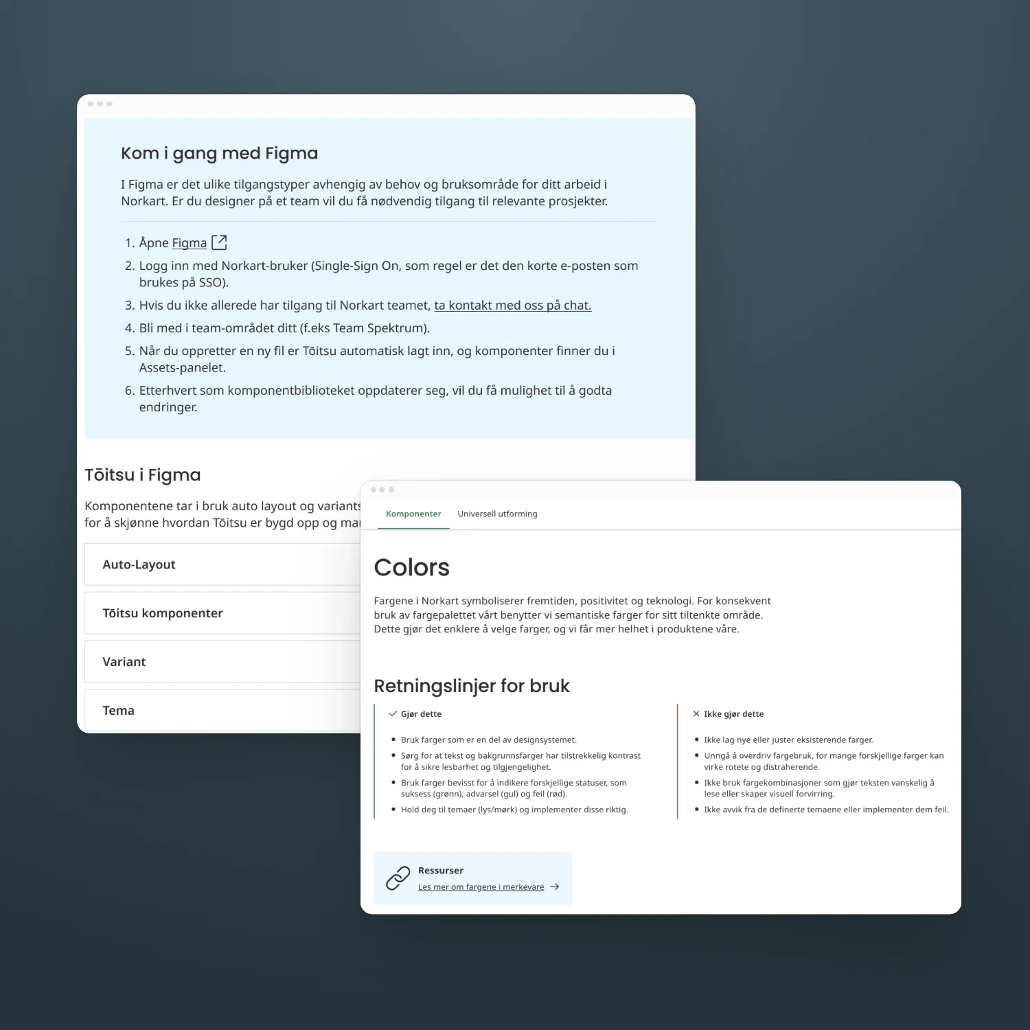
Tōitsu pages I contributed to, including the Figma onboarding steps and the Colors usage guidelines.
What I contributed to
An organised structure for getting-started content.
Onboarding prototypes and layouts within Tōitsu’s existing framework.
Written guidance for selected components.
Learning to design within an existing system
Working with existing components let me focus more closely on information, sequence and guidance. I also became more comfortable sharing work before it was fully polished. With a launch approaching, discussing unfinished ideas and responding to feedback were part of moving the work forward.
If I continued this work
I would observe new colleagues completing their first setup tasks to see where they hesitate, miss guidance or need support.
Accessibility considerations
Clear onboarding structure, concrete do and don’t examples and responsive layouts aimed to make the design system documentation easier to understand and use. An accessibility-focused next step would be to make keyboard behaviour, focus states and accessible naming explicit in the relevant guidelines.
Credits
Team: Asma Al-Sahli and Charlotte Skråmestø • Supervisors: Ingeborg Venås (Norkart) and Terje Stafseng (NTNU) • NTNU IDG3541 Design Internship, 5th semester, autumn 2024
Read next

