


Samfundet Gjøvik
Structuring a venue-booking experience around the decisions people need to make.
A mobile-first prototype connecting room choice, dates, services and estimated cost.
Project
Academic client project
Timeline
8 weeks • Spring 2024
Client
Samfundet Gjøvik
Team
5 multidisciplinary designers
My role
UX research, information architecture, interaction design and reusable UI components
Problem
Venue, availability, equipment, and cost had to be understood together, but the information was spread out and the process lacked a clear review point.
Outcome
A mobile-first booking flow connecting venue, date, services, and estimated cost, with a review step before the request.
My contribution
I contributed to planning and conducting the research and usability evaluation, synthesising findings into priorities, developing the prototype, and building reusable UI components. The work was completed collaboratively in a five-person multidisciplinary team.
At a glance
A booking decision spread across disconnected information

Understand the sequence
→
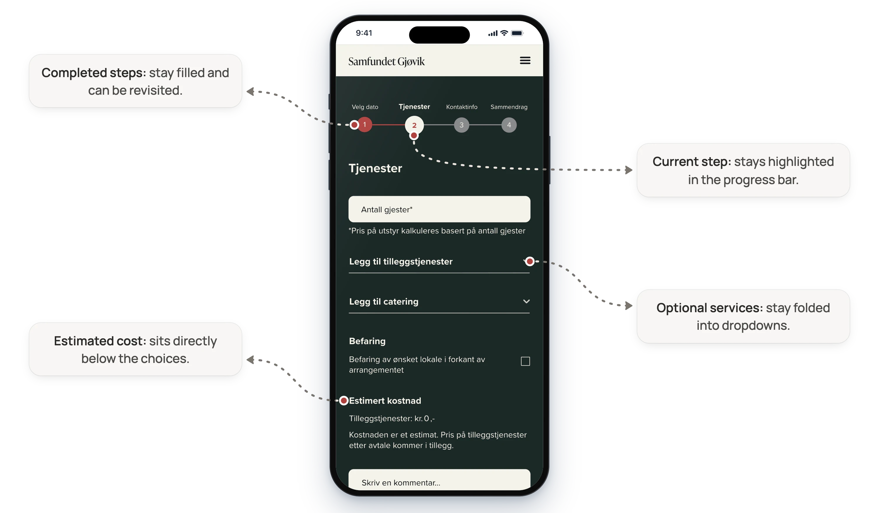
Visible, editable step progression
Anticipate cost
→
Estimate updated from participant count and selected services
Find related information
→
Navigation and categories informed by card sorting
Read and act confidently
→
Contrast-checked palette, hierarchy, and consistent components
The experience
One path from exploring a room to reviewing the booking
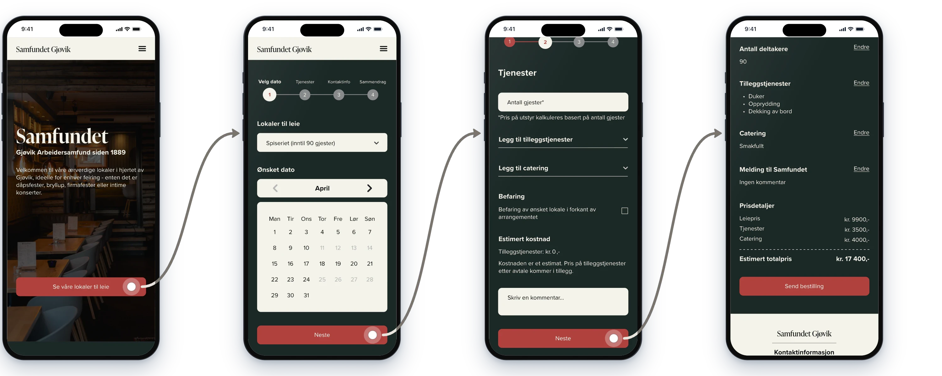
The prototype separates venue exploration from booking, then guides users through the choices needed to prepare a request.
Explore venue
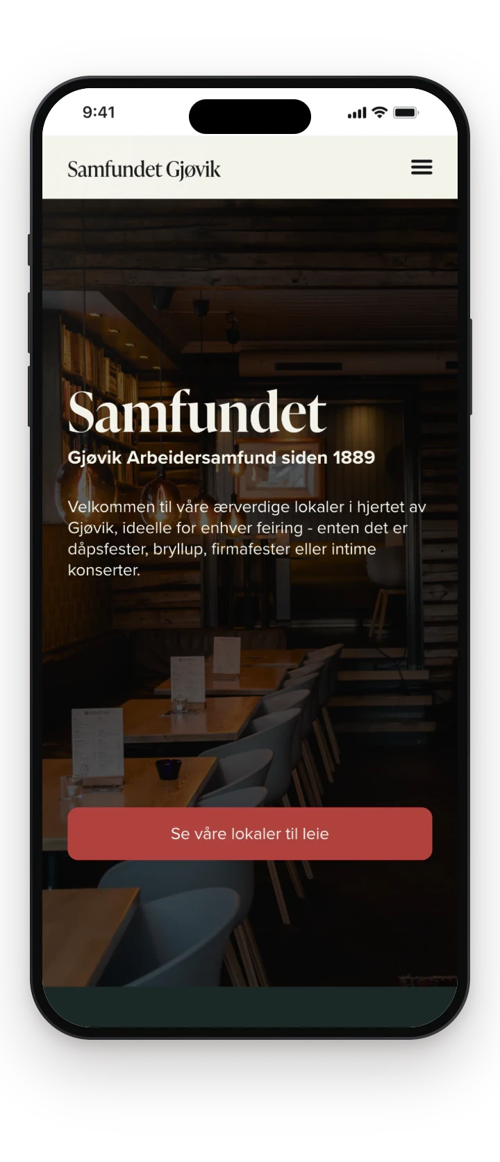
Start from the venue and move into the rooms available to hire.
Room + date
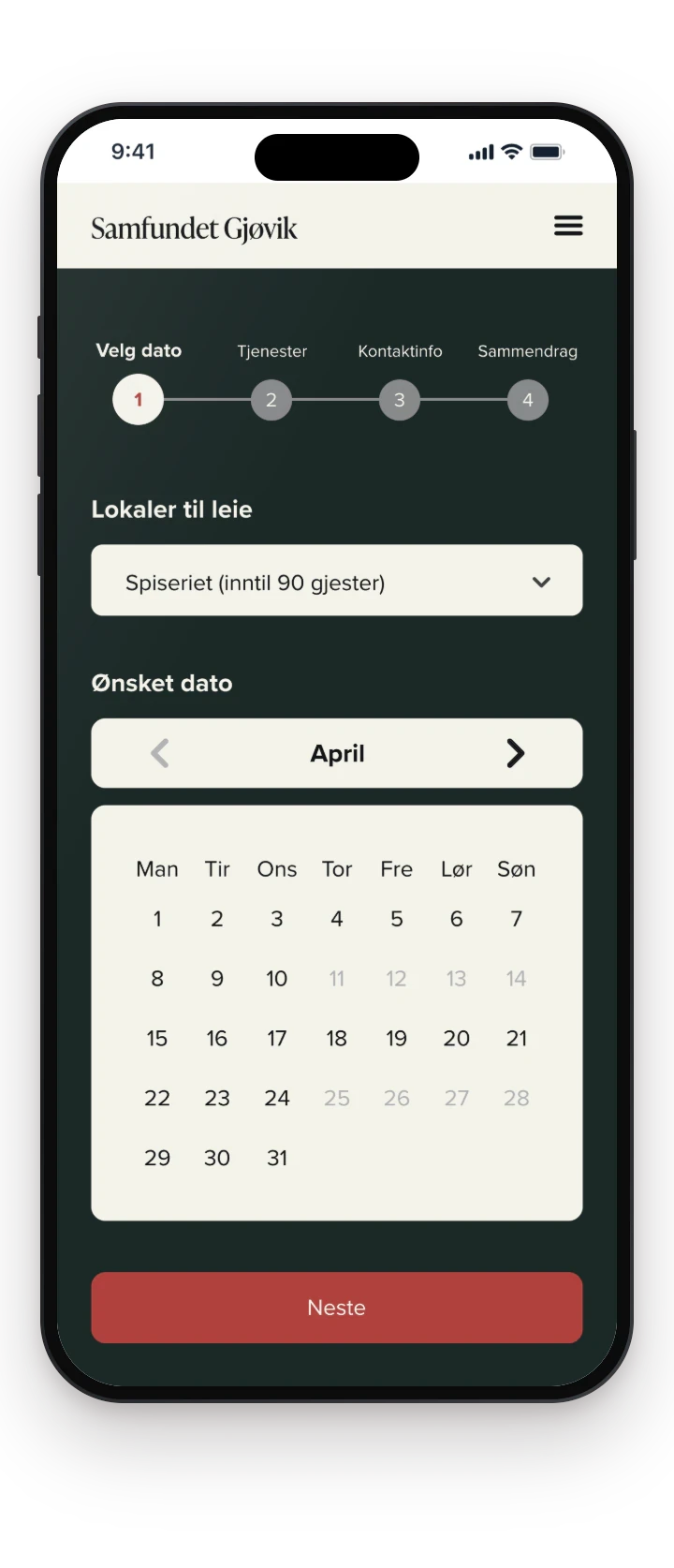
Choose a room and a date in the first booking step.
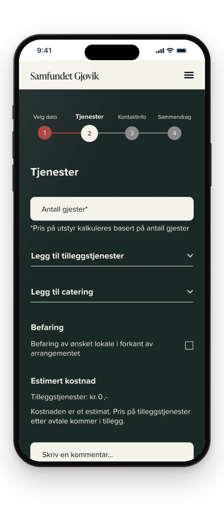
Services
Enter the participant count and add optional services, with the estimated cost below.
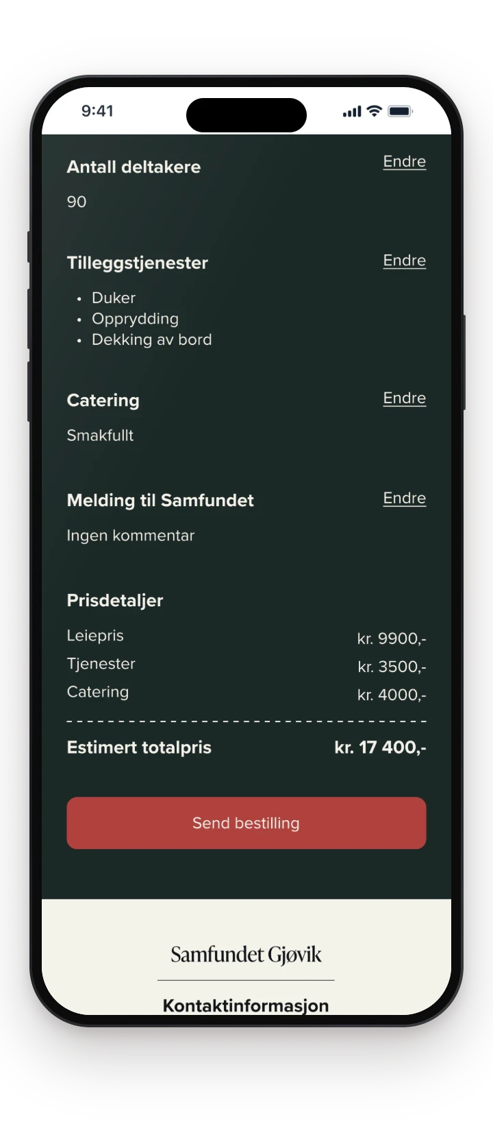
Summary
After contact details, review the room, date, services and estimated total before sending the request.
What we found
The friction came from missing connections between choices
Six participants completed booking tasks on the existing site, with short surveys before and after. A venue visit and client questions added operational and identity requirements.
Task-based usability testing
Before-and-after surveys
Venue visit
Client questions
Affinity mapping
MoSCoW prioritisation
People didn’t need more features. They needed to see how each choice affected the next.
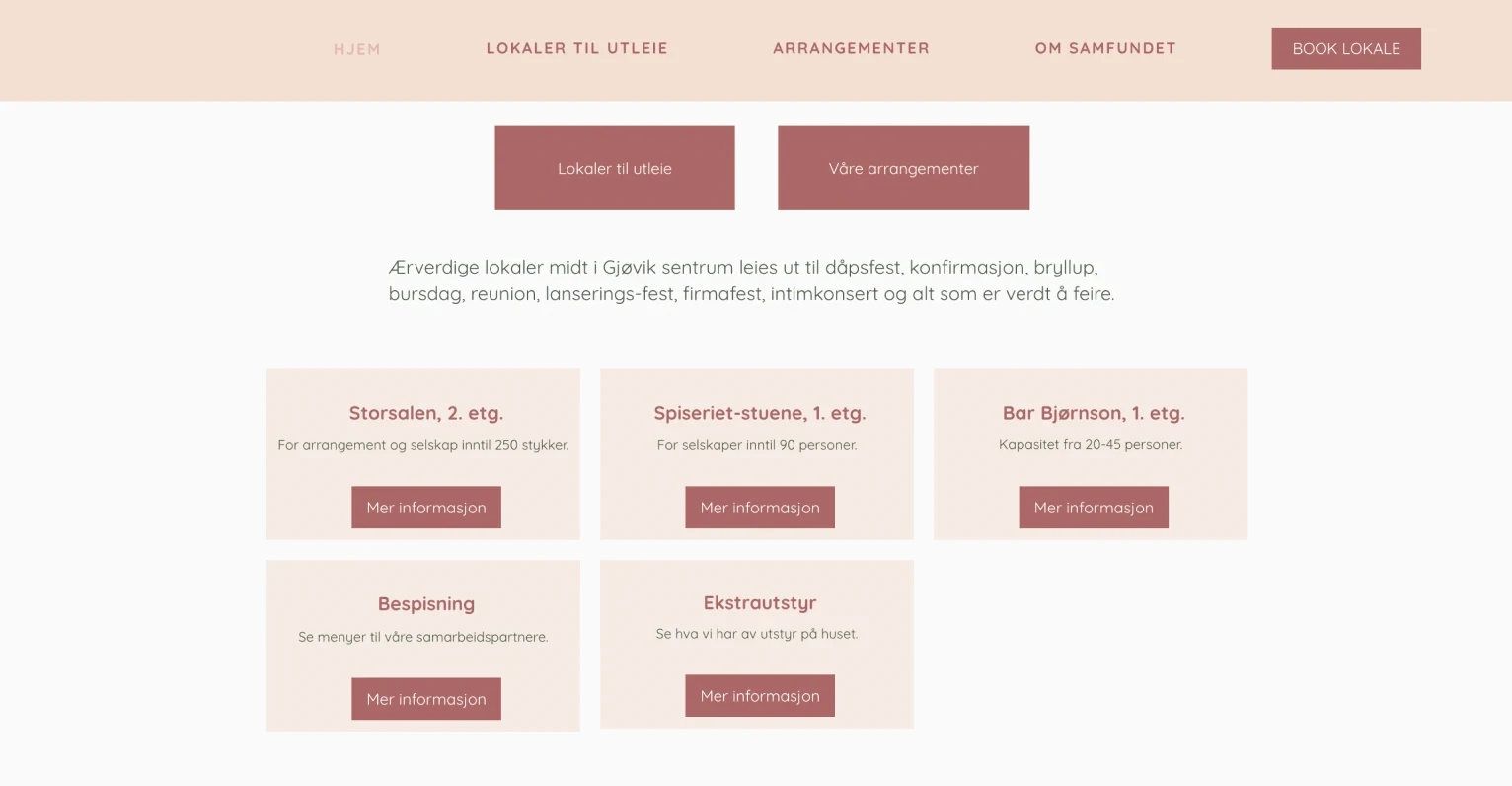
Starting point: the earlier site’s venue overview, the baseline for the task-based evaluation.
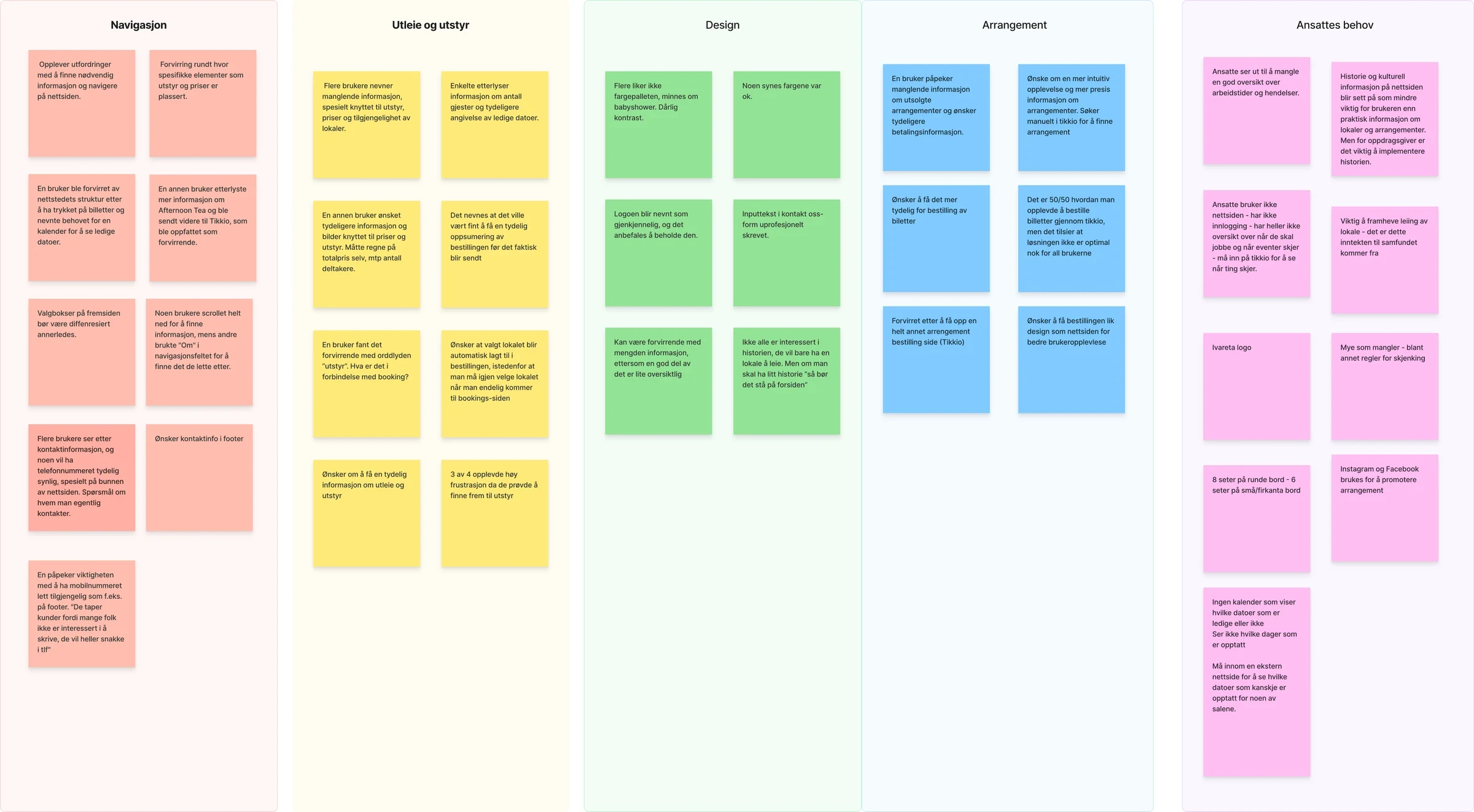
Baseline findings grouped around navigation, rental information, visual accessibility, events and staff needs. Research synthesis in Norwegian.
What we found, and what we changed
Equipment prices were hard to find
Show selected services and an estimated total inside the booking flow
Navigation didn’t match the tested tasks
Reorganise the content with hybrid card sorting
There was no overview before requesting
Add a summary step before the request is sent
Weak colour contrast in several places
A warmer, contrast-checked palette and consistent hierarchy
Ticket redirects to Tikkio confused some participants
Keep the established Tikkio route; direct integration stayed out of scope
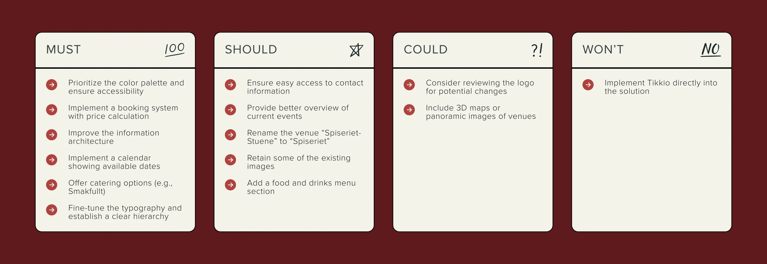
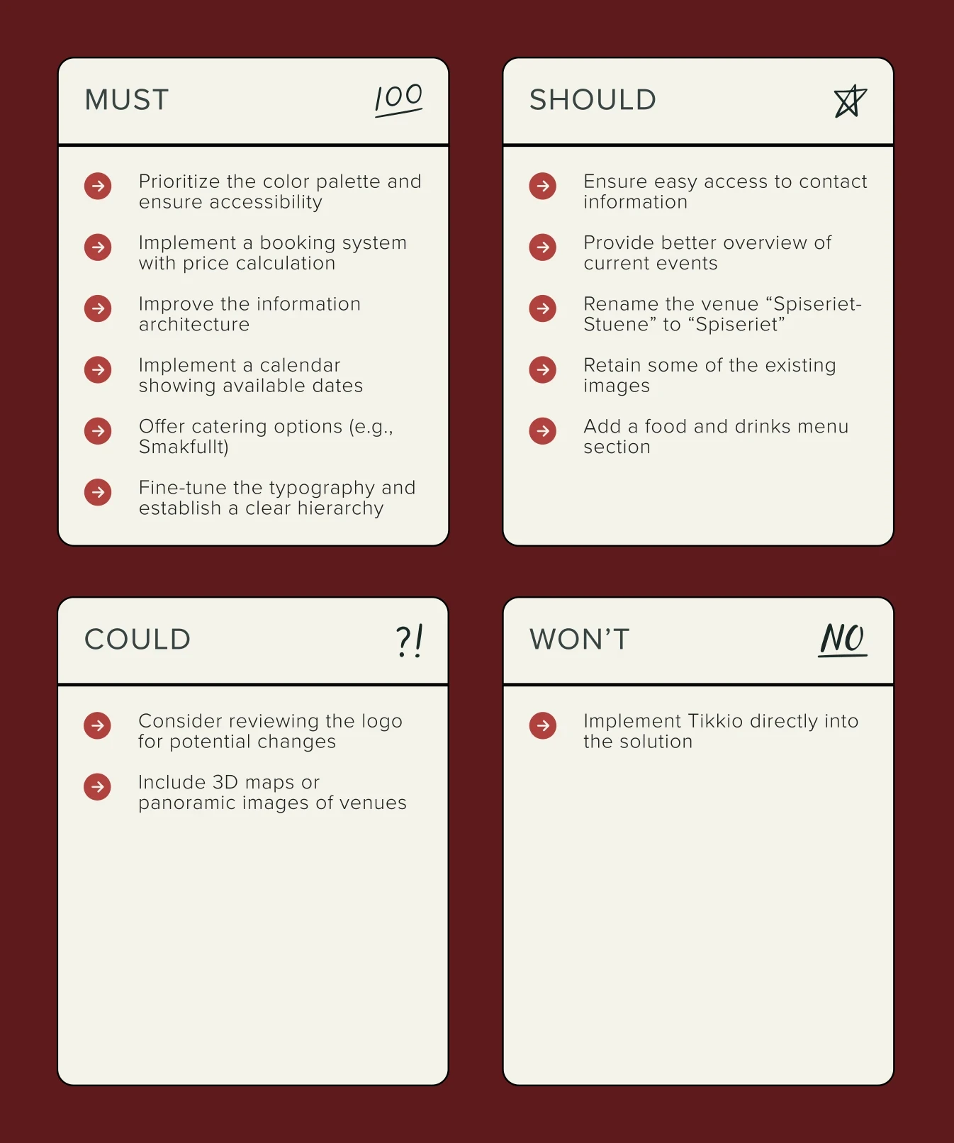
Prioritisation focused the eight-week project on structure and booking; immersive room views stayed outside scope.
Structure
Organising the service around how people look for information
We used hybrid card sorting to examine how prospective users grouped the site’s content. Two sessions included predefined top-level categories, while one allowed the participant to create their own. The exercise exposed ambiguous groupings and gave us a basis for reorganising the navigation.
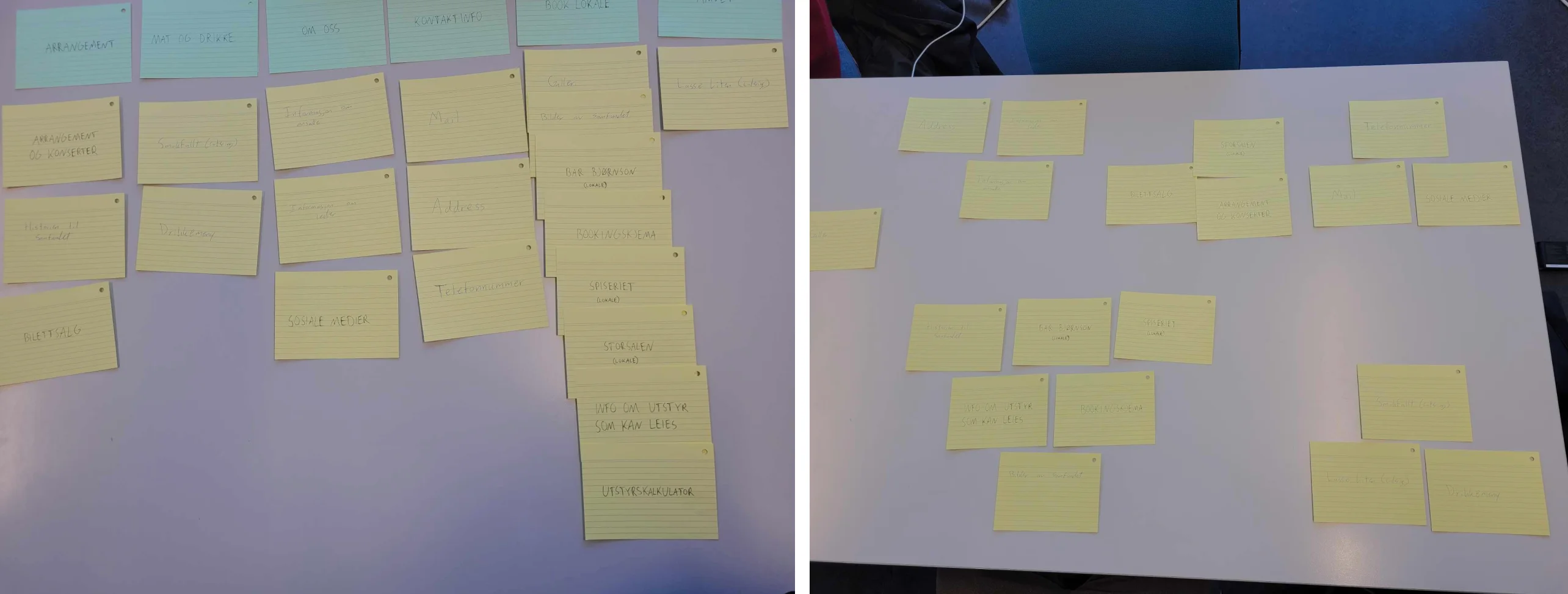
Hybrid card sorting used to examine how participants grouped venue content. Source evidence from two of the three sessions.
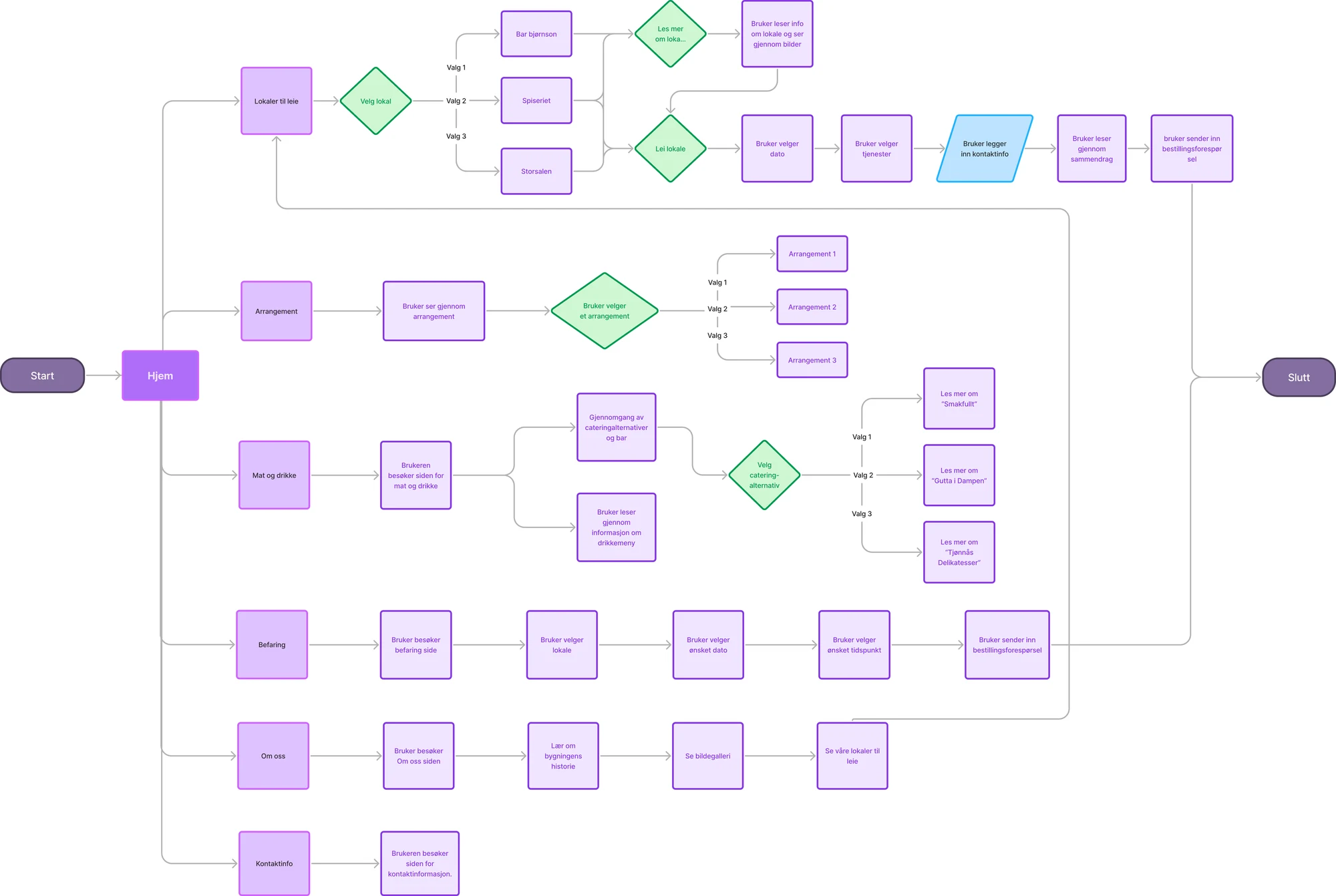
The project’s sitemap and main user flows: rooms and the booking route, events, food and drink, viewings, about and contact. Flowchart in Norwegian.
We separated browsing from booking: the wider navigation helps people understand the venue, while the booking sequence contains only the choices needed to prepare a request.
Iteration
Testing the sequence before refining the interface
Crazy 8 sketches helped the team compare early interaction directions. We then mapped the service flow and built mobile-first wireframes before testing a low-fidelity prototype. Working at low fidelity let us adjust navigation, content grouping, and booking interactions before investing in the final visual system.

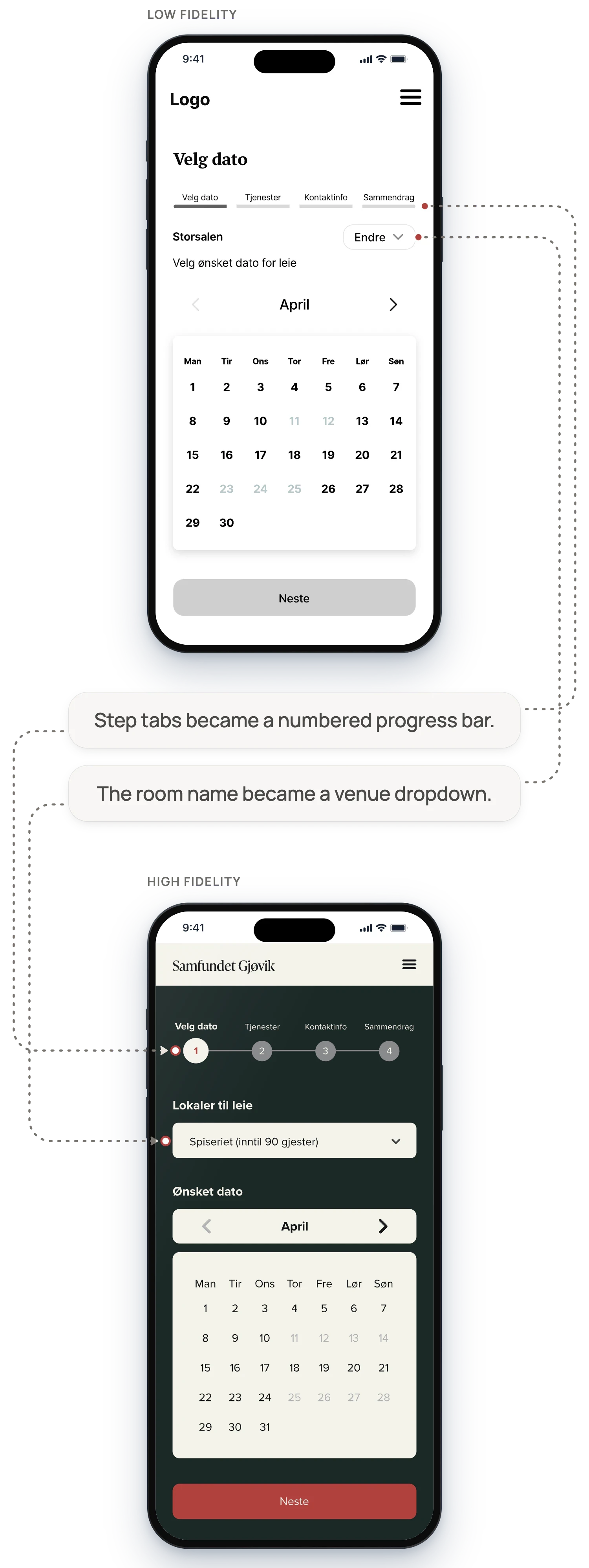
The same booking step, choosing a room and a date, at low and high fidelity.
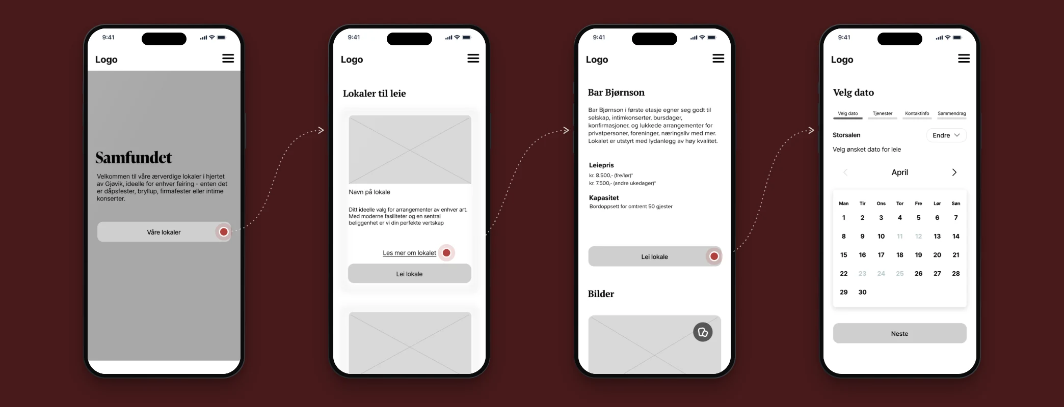
Low-fidelity flow from the home screen to the venue list, venue details and date selection.
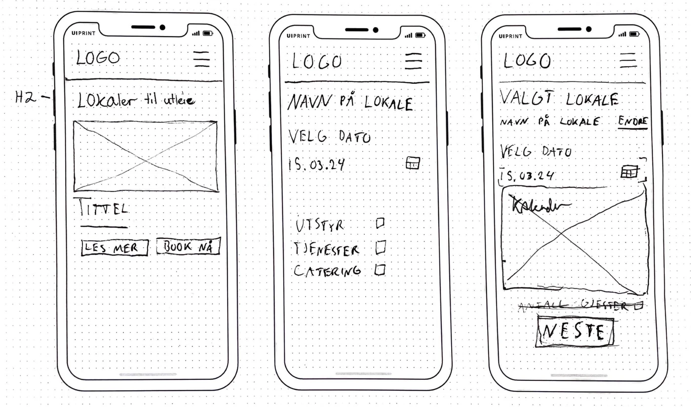
Early mobile sketch of the venue, date and booking screens.
What changed through iteration
Moved from broad page concepts to a defined mobile booking sequence.
Used dropdowns to contain optional detail and reduce simultaneous information.
Added visible progress and a way to return to earlier steps.
Added selected-service feedback and an estimated total.
Added a review stage before completion.
Interaction decisions
Feedback at the points where choices affect one another
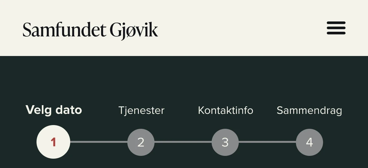

Detail crops at step 1 and step 3. Completed steps stay filled in the progress bar and remain selectable.
A booking path users can revisit
Problem
Room, date, details, and services form one decision, but a long form hides that relationship.
Design response
The booking is divided into visible steps. The current stage is emphasised, completed choices remain part of the sequence, and users can return to earlier steps without losing the overall context.
Cost feedback inside the choice
Problem
Participants could not easily locate or calculate equipment pricing for their event.
Design response
The services step uses a checklist and participant count to produce an estimated total at the point of selection. The estimate makes the consequence of adding a service visible before the request is reviewed.

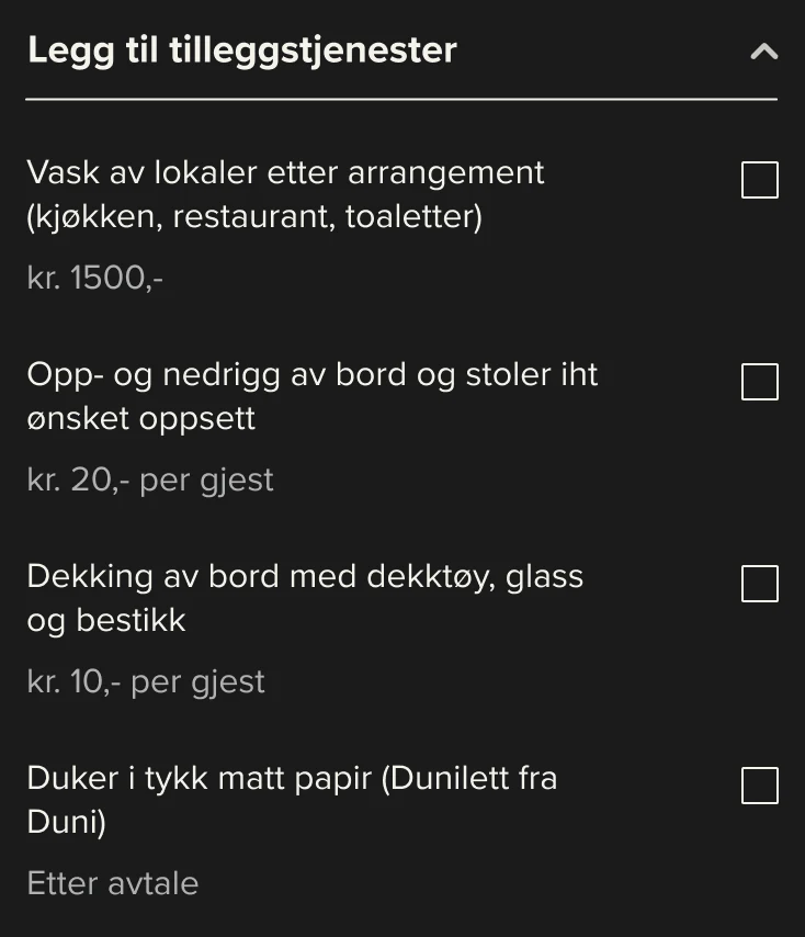
Detail: the add-on services dropdown opened, in its starting state. Per-guest and fixed prices sit beside each option.
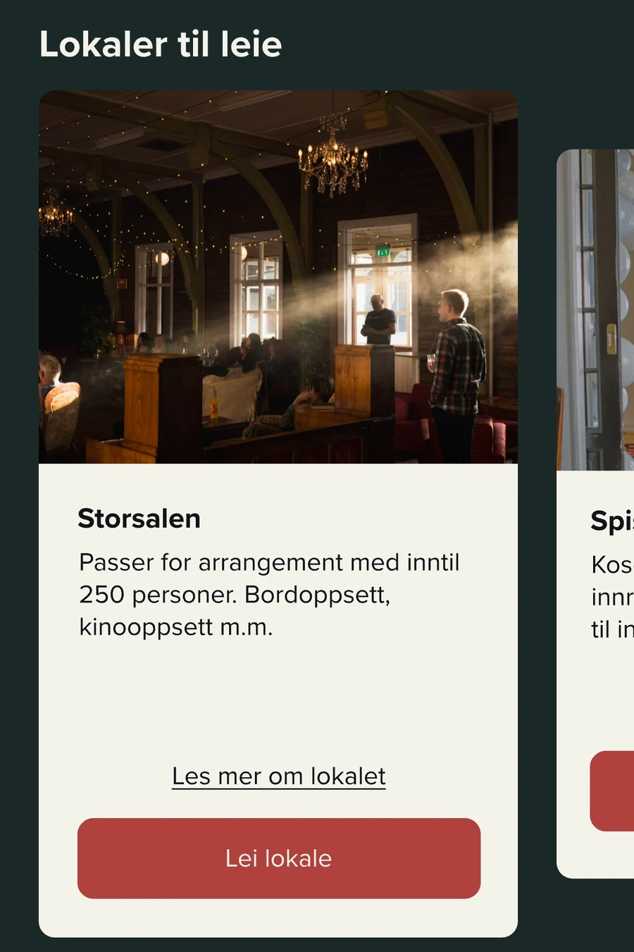
Home screen detail: two paths on every card, “Les mer om lokalet” (learn more) and “Lei lokale” (book the room), with the next room at the edge.
Focused room exploration
Problem
Users needed enough context to compare spaces without losing a clear route into booking.
Design response
A horizontally scrollable room collection keeps each space focused in the viewport. Cards snap into position and offer two distinct actions: learn more or begin booking.
Visual and component system
A visual system grounded in the venue and checked for readability
The team drew the palette from Samfundet’s interiors, using deep green, red, and warm neutral tones to reflect the venue’s character. Contrast checks informed the final combinations, while reusable Figma components kept behaviour and hierarchy consistent across screens.
Calendar • date states


Available

Picked

Unavailable

Blank
Progress bar • steps 1–4
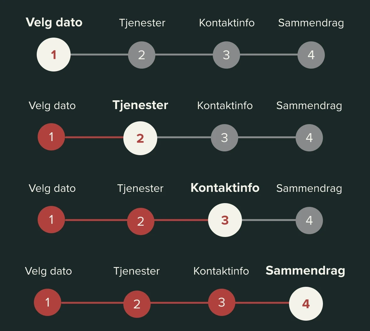

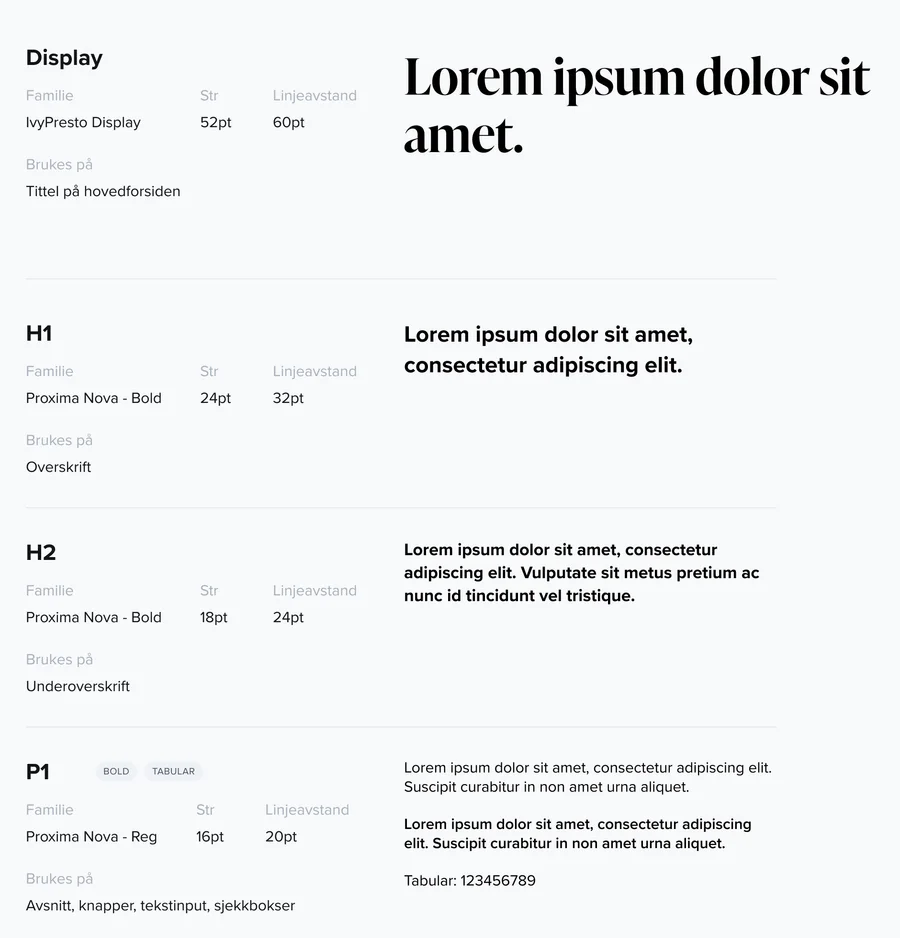
Foundations, excerpt: type scale and colour palette. Specification sheets in Norwegian.
The system balanced a formal, welcoming tone with functional clarity. Reusable components also made interactive states easier to apply consistently across the prototype.
Accessibility considerations
Contrast-checked colours, a clear form hierarchy, reusable patterns and labelled step and date states aimed to keep each booking stage understandable. Keyboard navigation, focus order and accessible feedback were not tested and would need validation in implementation.
Outcome
A clearer model for preparing a venue request
The final prototype brought venue exploration, date selection, optional services, estimated cost, and review into one connected journey. It also established a clearer site structure, reusable components and contrast-checked visual patterns.

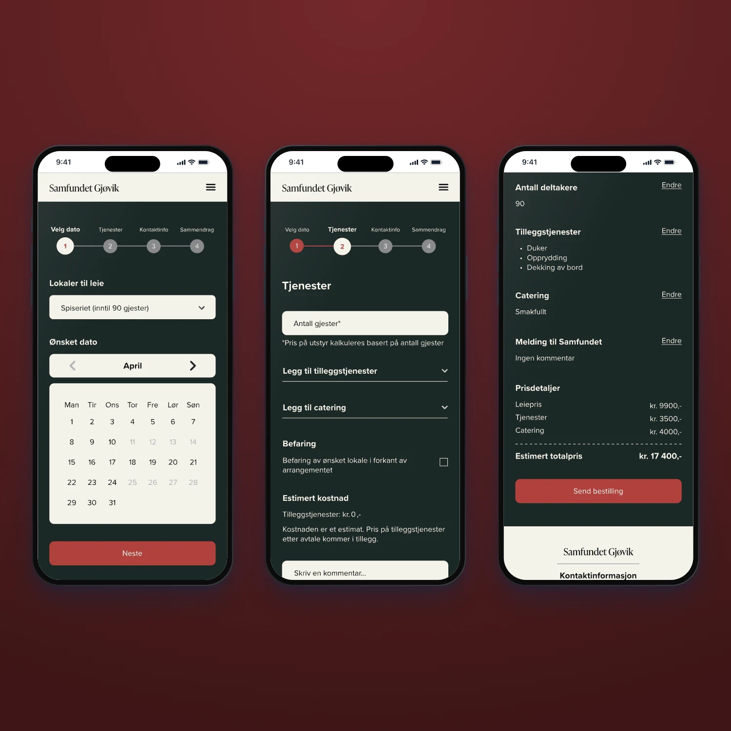
The high-fidelity booking journey, from choosing a room and date to the summary with the estimated total.
A guided booking sequence with visible progress and editable stages
Pricing feedback connected to participant count and selected services
Navigation categories informed by card sorting
Contrast-checked colours and reusable interactive components
The work remained a prototype and was not launched, so the outcome should be read as a tested design direction rather than proven operational impact.
Reflection
What I would strengthen next
The project showed me that booking clarity depends on making relationships visible, not simply shortening a form. Venue, date, services, and cost need to behave as parts of the same decision.
I would establish the component system and auto-layout rules earlier in a future iteration. That would make structural changes faster and reduce manual inconsistency while the flow is still evolving.
Next steps
Validate the high-fidelity end-to-end flow with representative renters.
Test comprehension of estimates, optional services, and the final review state.
Define the operational rules and backend data needed for live availability and pricing.
Audit the complete interface against the current applicable accessibility requirements.
Explore panoramic room previews only after the core decision flow is validated.
Credits
Team: Asma Al-Sahli, Sondre Skytteren, Fredrik Forsberg, Johanne Bjørklund and Jenny Ngo Luong • Supervisor: Mari Hermansen • NTNU IDG2200 Design and Prototyping, 4th semester, spring 2024
Read next

