


KompKart
A service concept for making digital competence needs visible in municipal healthcare.
Our brief asked how healthcare employees could strengthen their digital competence. Research revealed a wider service problem, so we designed KompKart to connect mapping, interpretation, reporting, and follow-up.
Project
Bachelor thesis
Timeline
17 weeks • Spring 2025
Client
Gjøvik Municipality
Team
3 interaction designers
My role
Service design • Research synthesis • Information architecture • UI prototyping
Problem
Support was reactive, responsibility for follow-up was unclear, and recurring needs were never gathered into a shared view.
Outcome
A recurring service connecting employee mapping with department-level interpretation and follow-up.
My contribution
Our team of three interaction designers did the research, concept development and testing together. My focus was service design, research synthesis, information architecture and UI prototyping.
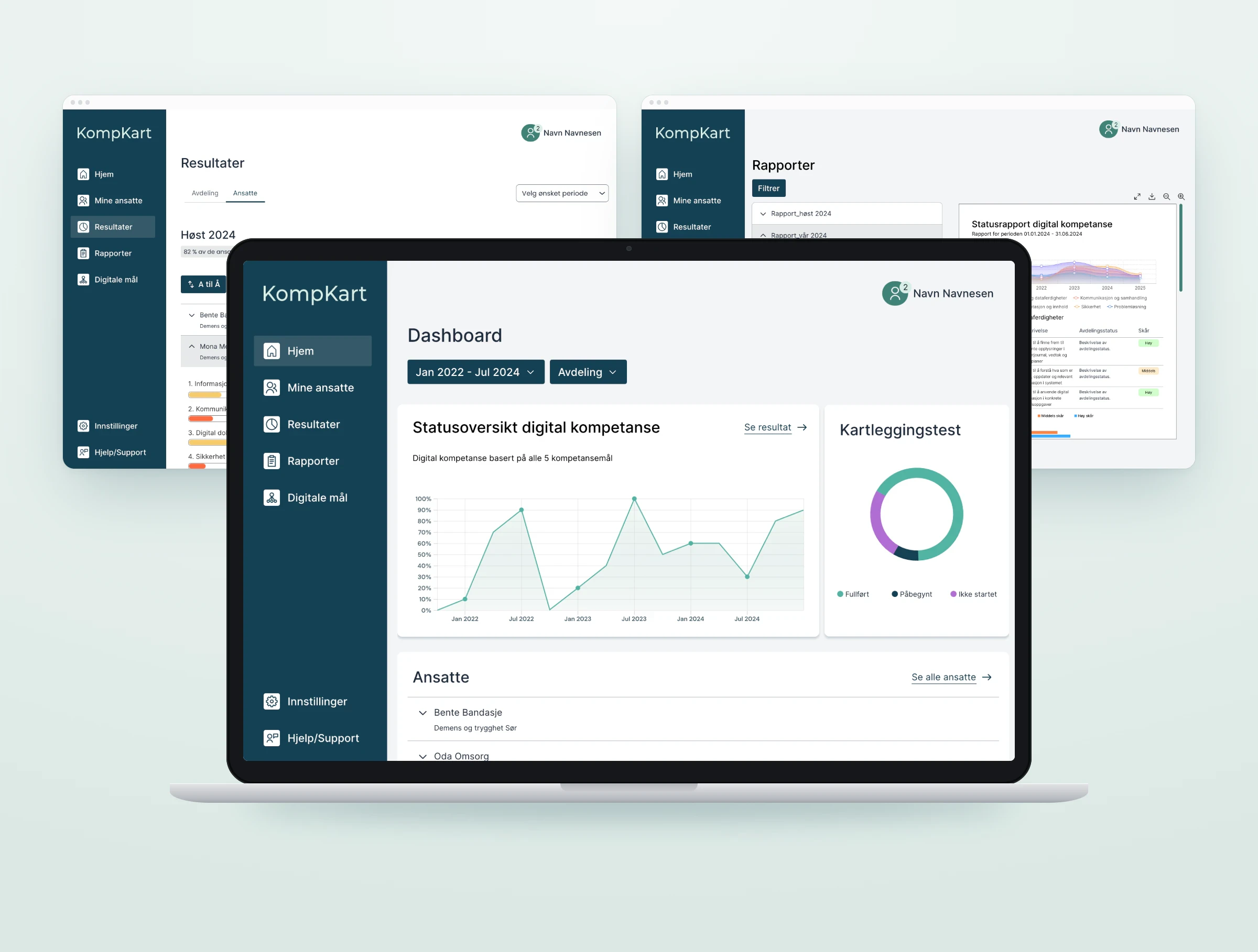
Four connected parts: competence mapping, a department dashboard with named employee results, periodic reports, and five adapted DigComp areas as the shared reference.
Support was happening, but it left no trace
Questions surfaced in the middle of care work. Employees relied on whoever was available, super users solved the immediate problem, and the same need could return without being recorded or discussed at department level.
Needs appeared mid-task
Questions surfaced while care work was already in progress.
Help depended on availability
Support varied with shifts, time, and confidence in asking.
The role varied in practice
Employees did not always know who the super users were or what support they could expect.
Solved issues disappeared
Immediate help left no department-level record for later follow-up.
Actor map
Responsibility and information were split across employees, super users, managers, municipal advisers, IT, and suppliers. No single role held the whole picture. This moved the project from an employee-learning problem to a coordination problem.
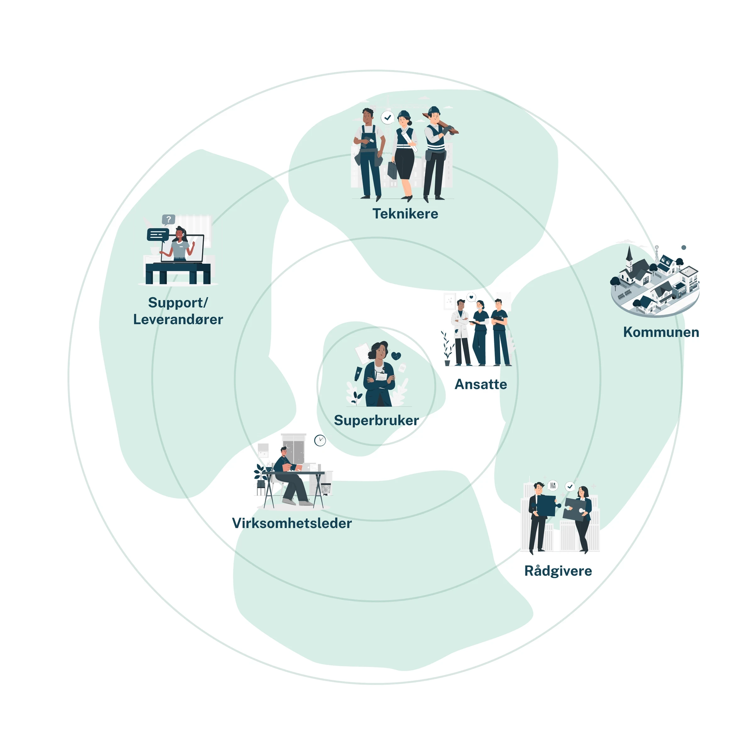
We followed how support moved through the organisation
We compared the intended support model with everyday practice, then mapped where needs and responsibility became unclear.
Interviews
Contextual observation
Mini focus group
Actor mapping
Journey mapping
Empathy mapping
Affinity synthesis
Support was reactive
Design consequence: Surface needs before they become urgent.
The role was inconsistent in practice
Nobody was clearly responsible for following up a need once the immediate problem was solved.
Design consequence: Make ownership and follow-up explicit.
There was no persistent overview
Design consequence: Create a shared view that persists over time.
Journey map • Super user
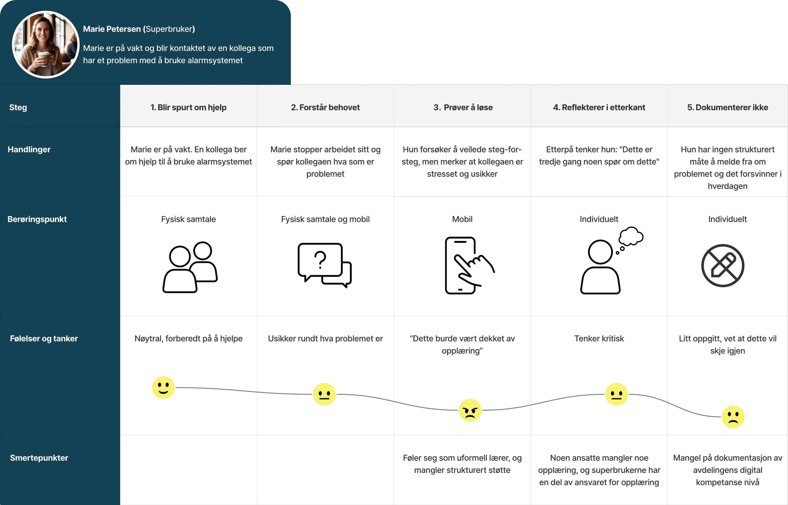
Where the need disappeared
The journey map exposed a repeated break in the final step: the immediate issue was resolved, but nothing was documented or carried into later support.
Empathy map • Super user
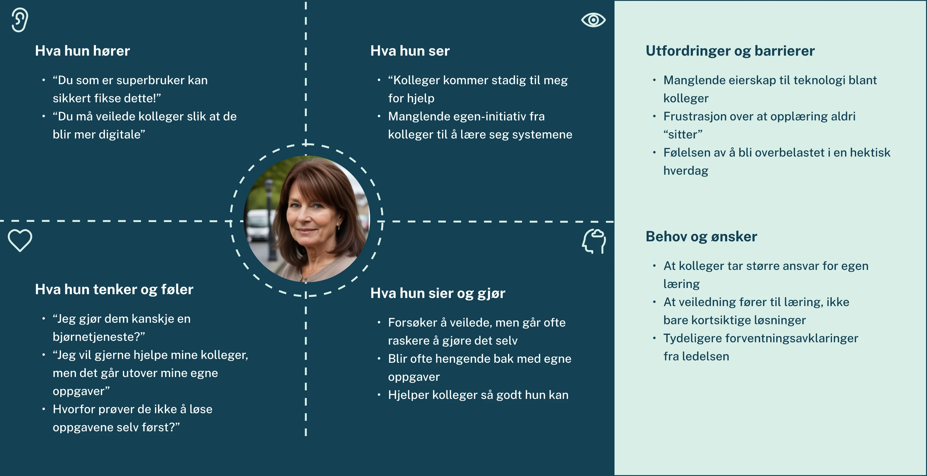
Willingness was not the problem
The empathy map separated super users’ motivation from the conditions around the role. They wanted to help, but interruptions, limited time, and unclear expectations kept support reactive.
“They help when we ask, but not in a way that says everyone needs to know this.”
Employee • translated from Norwegian
Competence varied between employees, but the immediate design problem was that needs, responsibility, and follow-up were not visible in one place.
We stopped designing more training, and started designing the system around it
The original brief treated this as an employee-level question. Research showed that more training would not resolve unclear responsibility, reactive support, or the missing overview of needs.
Original brief
How might we strengthen digital competence among healthcare employees?
Research revealed
Informal learning already happened through trial, error, and asking for help.
The super-user role lacked consistent expectations and protected time.
Managers and super users had no shared overview of who needed what.
Reframed challenge
How might we help super users make competence needs visible and coordinate follow-up without adding unnecessary work?
The shift was from more training content to the structure around learning: mapping, interpretation, responsibility, and follow-up.
We chose the direction that created a shared baseline
Six concepts responded to different symptoms. Help requests, super-user training, a quiz, a support stand, and incident logging could improve access or engagement. Only the mapping and follow-up direction made competence patterns visible across the department, created a recurring baseline rather than one-off help, and connected what it found to ownership and follow-up.
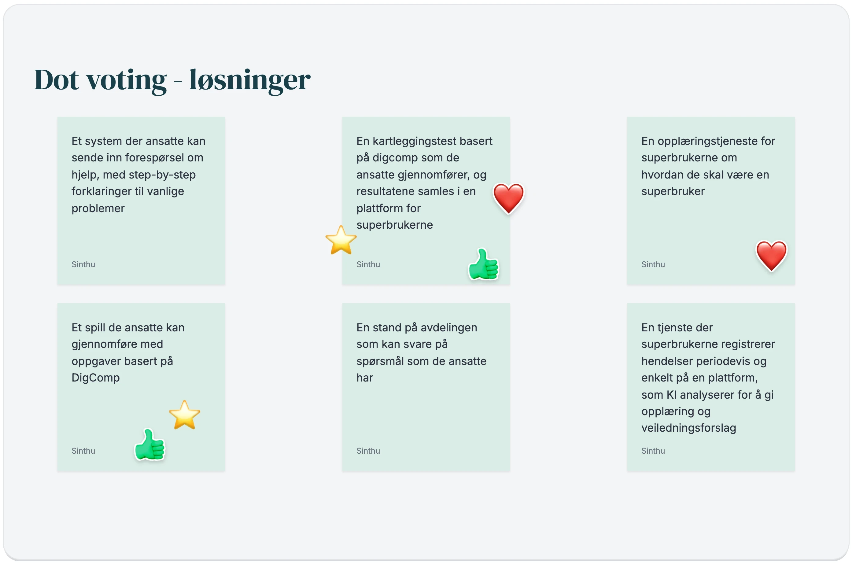
Dot voting on the six directions. Prototype artefact • Norwegian
Scope guardrail
Core prototype
Mapping • Dashboard • Employee overview • Reports
Deferred
Comparison • Export • SSO • Integration exploration
Not validated
Question bank • Scoring model • Prescribed measures
Mapping only mattered if someone could act on it
Early testing showed that better assessment wording was not enough. A result needed a path from employee input to interpretation, prioritisation, and follow-up.
From
A standalone DigComp-based assessment
To
A service connecting mapping, results, reports, and digital competence goals
Proposed service loop
1
Map
An employee reports needs across adapted DigComp areas.
Employee
2
Structure
KompKart updates individual and department views.
KompKart
3
Interpret
The super user identifies patterns and people who may need support.
Super user
4
Coordinate
The super user and manager prioritise follow-up.
Super user + manager
5
Re-map
A later mapping creates a new comparison point.
Employee

KompKart organises self-reported information. People still interpret the result and decide what support is appropriate.
Solution visualisation
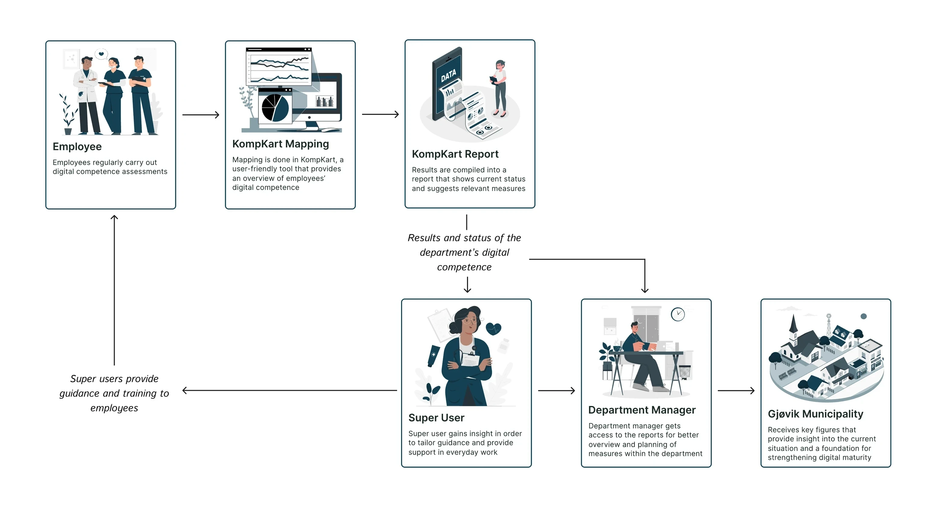
Who does what: employees complete the mapping, KompKart turns the results into reports, the super user and department manager follow up, and the municipality receives key figures.
Information architecture
Dashboard
Employees
Results
Reports
Digital goals
Service blueprint
Testing whether the frontstage concept had a workable backstage
We built the blueprint after the concept expanded beyond assessment, to connect employee actions and interface touchpoints with the people, handoffs, and supporting processes required behind them.
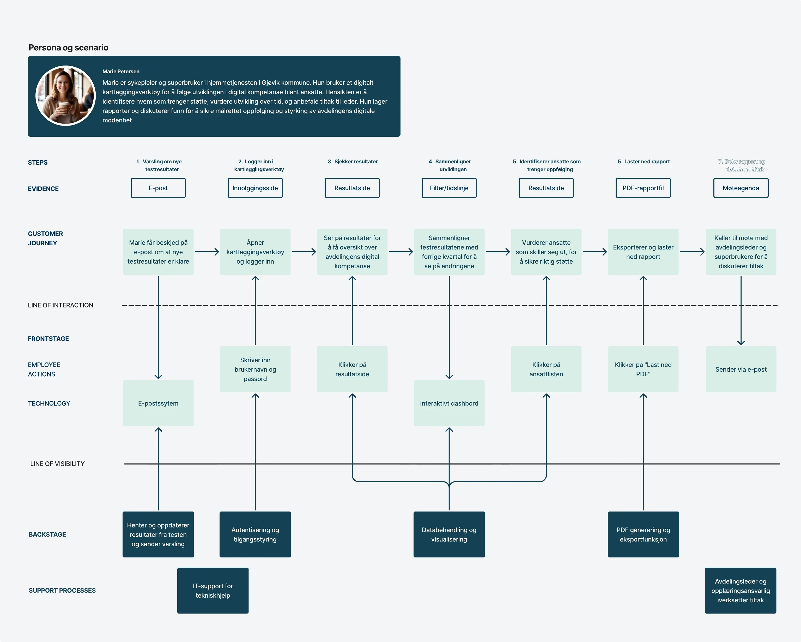
Screens could not solve ownership.
The blueprint made the backstage dependencies visible: who starts a mapping round, who follows up, and how the service connects to existing municipal systems. These responsibilities remained assumptions requiring further validation.
Original service blueprint. Artefact in Norwegian.
Testing changed the system, not just the interface
Each round challenged a different assumption: whether the questions made sense, whether results could guide action, and whether the service could fit the organisation.
Round 1 • From questions to a service
Tested
How employees interpreted the early competence questions.
Learned
Clearer wording did not make the result useful if nobody owned the next step.
Changed
The concept expanded from a standalone assessment into mapping, results, reports, and digital competence goals.
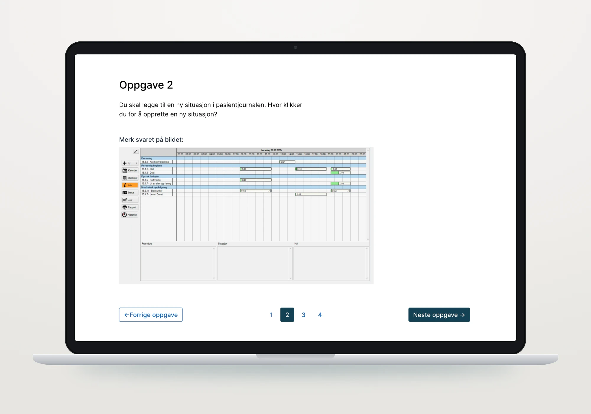
The early assessment task, tested for how employees read the questions. Prototype artefact • Norwegian
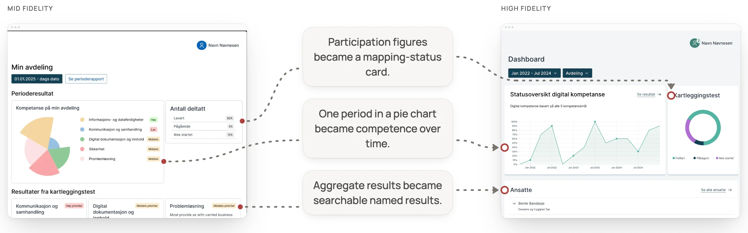
Round 2 • From aggregate data to follow-up
Tested
How super users read the department overview and found support needs.
Learned
An aggregate pattern did not show who needed follow-up, and completion status was too difficult to find.
Changed
We clarified chart explanations, surfaced mapping status, and added searchable named employee results.

Round 3 • From useful concept to organisational fit
Tested
The high-fidelity service concept as a whole.
Learned
The shared overview was relevant, but trust, workload, ownership, and “another system” threatened adoption.
Changed
We used familiar Digdir patterns and treated integration with an existing municipal platform such as EQS as part of the direction.
Testing made the concept more useful and the unresolved risks more specific. The result was a better-defined prototype, not an implementation-ready service.
A shared view from mapping to follow-up
The final prototype connected a department dashboard, named employee results, periodic reports, and five adapted DigComp areas. Together, they turned mapping into material that super users and managers could interpret and discuss.
The tested high-fidelity prototype: the department dashboard on a laptop, with the employee results and reports screens behind it.
The interface uses components from the Norwegian Digitalisation Agency’s design system (Digdir), to reuse patterns municipal staff already meet elsewhere. A design intention and foundation, not a compliance claim.
Accessibility considerations
Competence results are sensitive, so a readable hierarchy, clear mapping states and a defined access model mattered as much as the visual design. Not yet tested: keyboard navigation, form feedback and whether results stay understandable without colour cues.
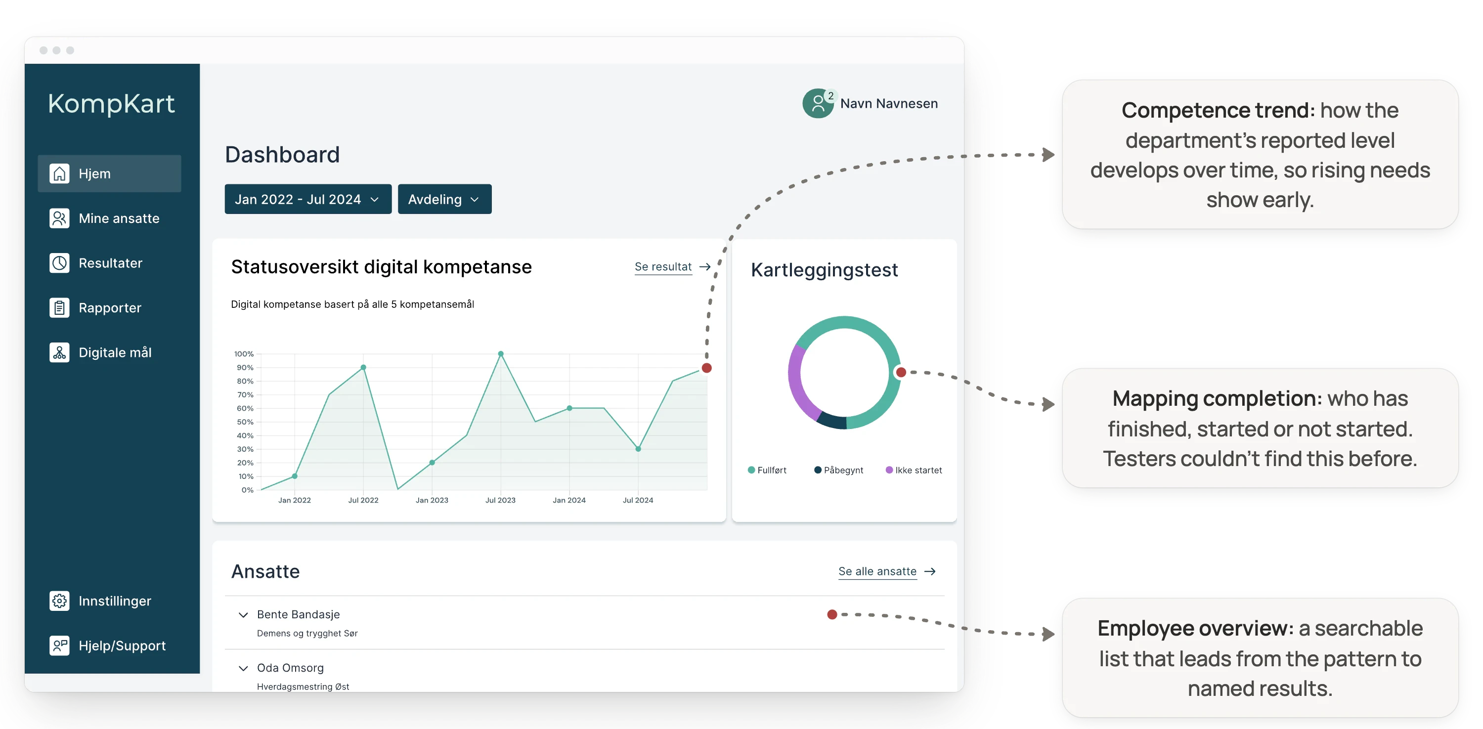
Dashboard
See the department before opening an individual record
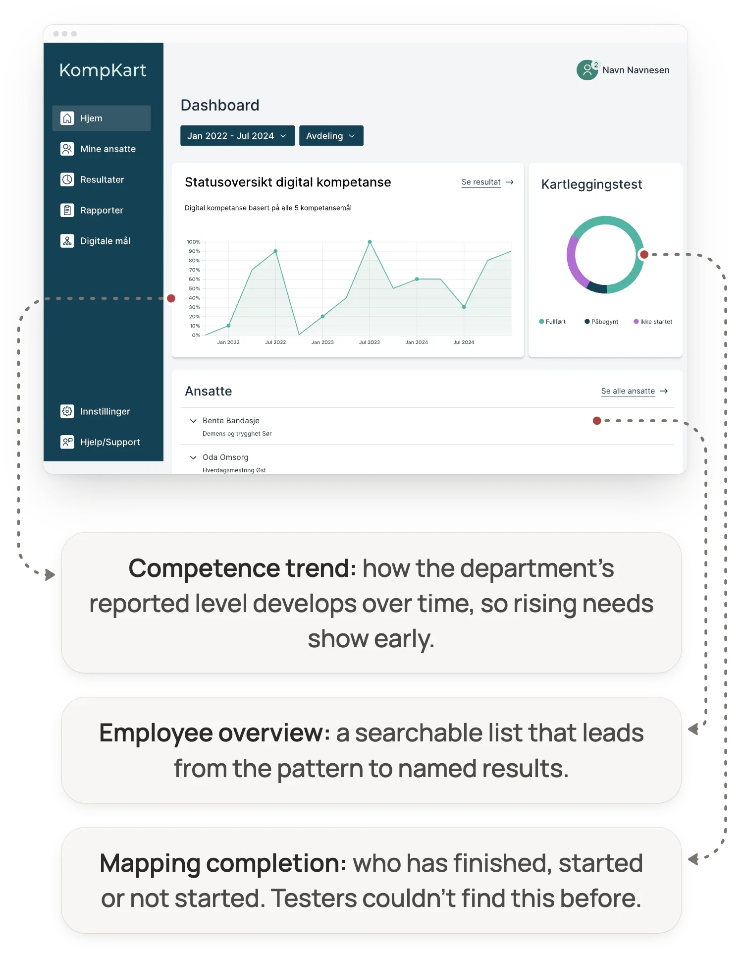
The dashboard brings together competence patterns over time, mapping completion, and a searchable employee overview. It helps super users move from a department-level signal to the people behind it.
Employee results
Move from a pattern to targeted follow-up
Named results show reported strengths, gaps, and mapping status across the adapted competence areas.
More actionable, potentially less honest
Named results support targeted help, but identifiable self-reporting may change how employees answer. We did not resolve this tension.

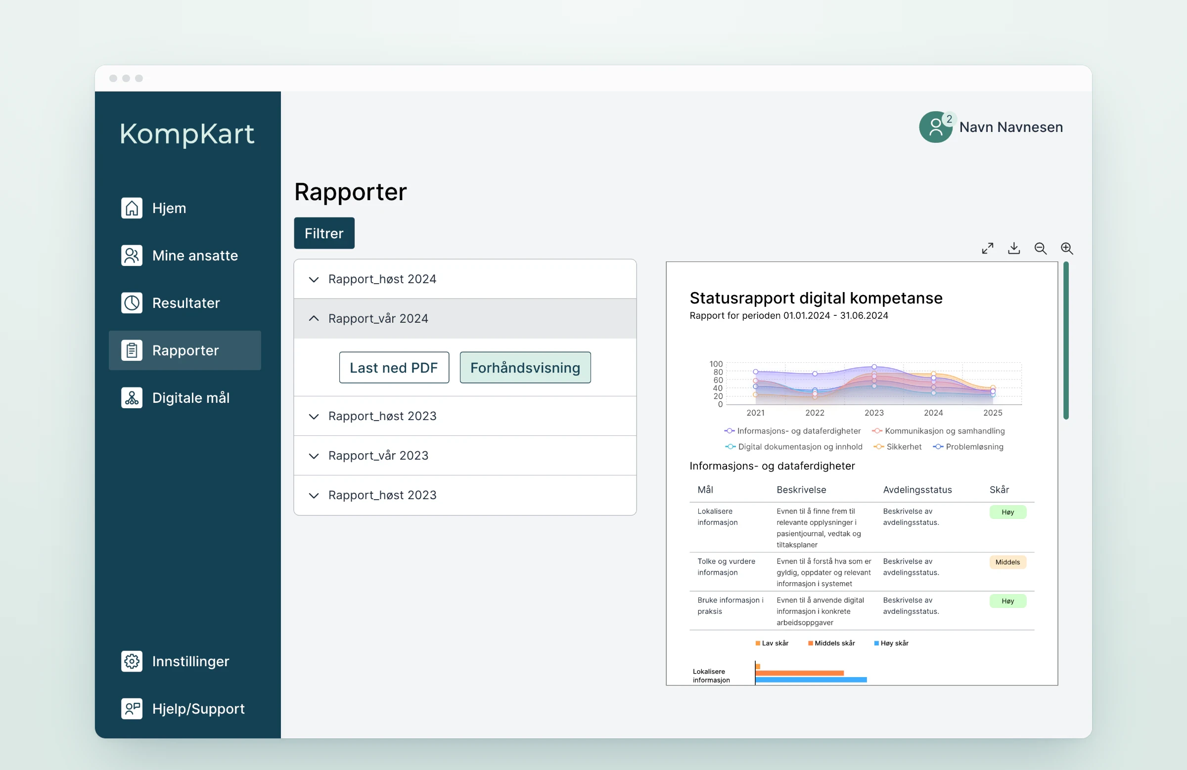
Reports
Turn mapped results into a management conversation
Periodic reports organise results into material that super users and managers can use when prioritising support. They provide a decision basis; they do not make the decision.
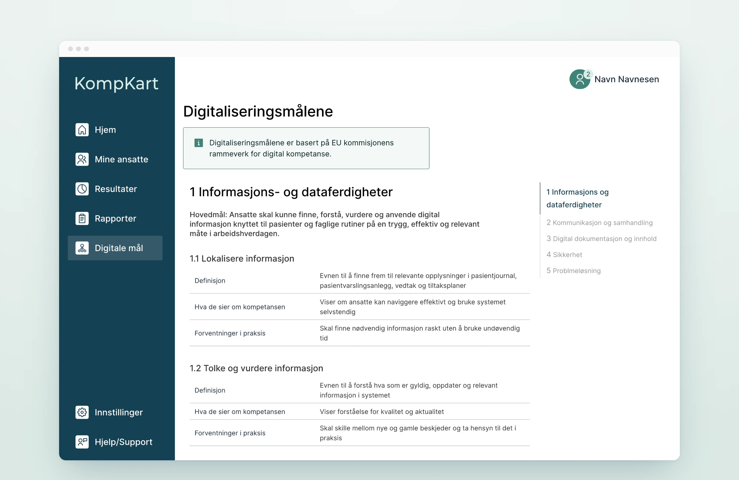
Digital competence goals
Give the data a shared language
Five areas adapted from DigComp structure how needs are interpreted: information and data, communication and collaboration, documentation and content, security, and problem solving.
Proposed, not validated
We designed the categories and interface structure, but not a complete validated question set or scoring model.
Reflection
What the work established, and what still needs validation
The clearest way to read this project is to separate what the research and prototype supported from what would require implementation and longer-term evaluation.
What I take from it
1
Design the operating model with the interface.
A dashboard has little value without clear responsibility for interpretation and follow-up.
2
Actionable data has a trust cost.
Named results can enable targeted help while making honest self-reporting harder.
3
Integration is part of the experience.
In public services, technical fit and governance directly affect workload, adoption, and trust.
What the work established
Assessment alone was insufficient.
Mapping needed interpretation and ownership.
Shared visibility was relevant to stakeholders.
What remains unproven
Honesty of identifiable self-reporting.
Validity of questions and scoring.
Workload, governance and long-term adoption.
What should happen next
Resolve the privacy and access model.
Validate the question set and scoring.
Define ownership and protected follow-up time.
Explore integration with an existing municipal platform.
Pilot the service in one department before scaling.
KompKart did not prove that a dashboard could improve digital competence. It established that competence mapping only becomes useful when visibility, interpretation, responsibility, and follow-up are designed together.
Credits
Team: Asma Al-Sahli, Sinthu Sofie Mosbye and Martine Hamre Renaas • Supervisor: Emil Bakke • Bachelor thesis for Gjøvik Municipality, 6th semester, spring 2025
Read next

